T-Mobile – ACS Platform for Device Management Platform
Project Definition
Project Name: T-Mobile ACS 2.0 Platform for Device Management
Role: Lead UX/UI Designer
Tools Used: Figma, Sketch, InVision, UserTesting
The goal was to redesign T-Mobile’s ACS (Auto-Configuration Server) platform for managing and monitoring CPE (Customer Premises Equipment) devices. The challenge was to improve the platform’s usability while maintaining complex functionality for device management and ACS integration using the CWMP protocol.
Problems and Solutions
After conducting extensive user research, key pain points included:
- Difficulty navigating between devices and features.
- Lack of clear device status and configuration feedback.
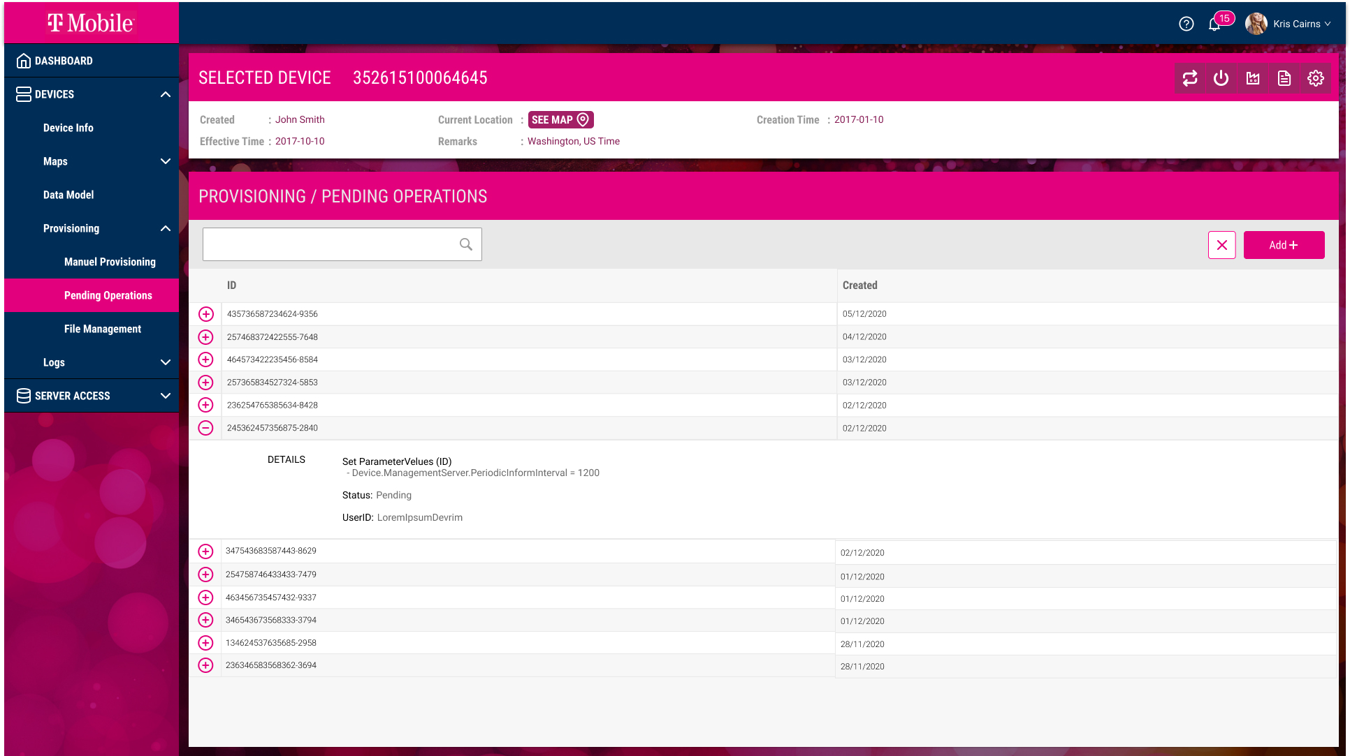
- Complex workflows for common tasks such as provisioning and monitoring devices.
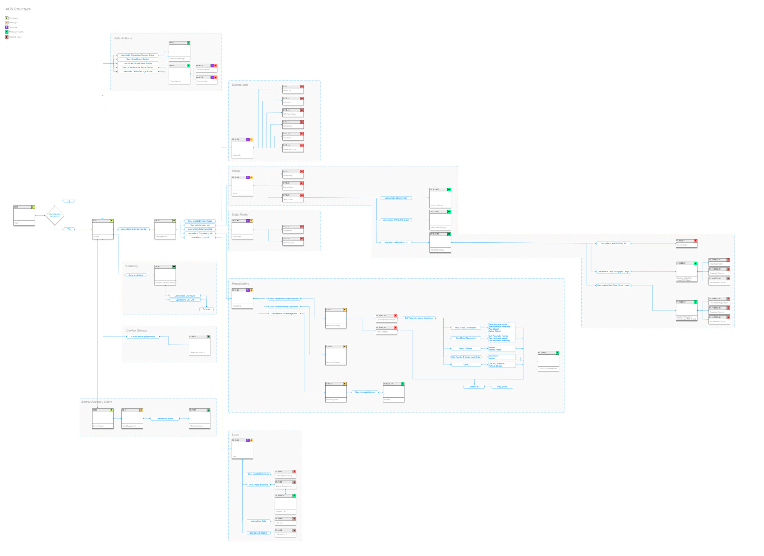
Our task analysis revealed inefficiencies in the user flow, motivating the need for an intuitive interface and clearer navigation paths.
The previous ACS platform was challenging to use, with a cluttered interface and confusing workflows. It was crucial to enhance the user experience by streamlining the interface, ensuring that the users, mostly network operators and administrators, could easily manage and monitor CPE devices without frustration.
The Approach
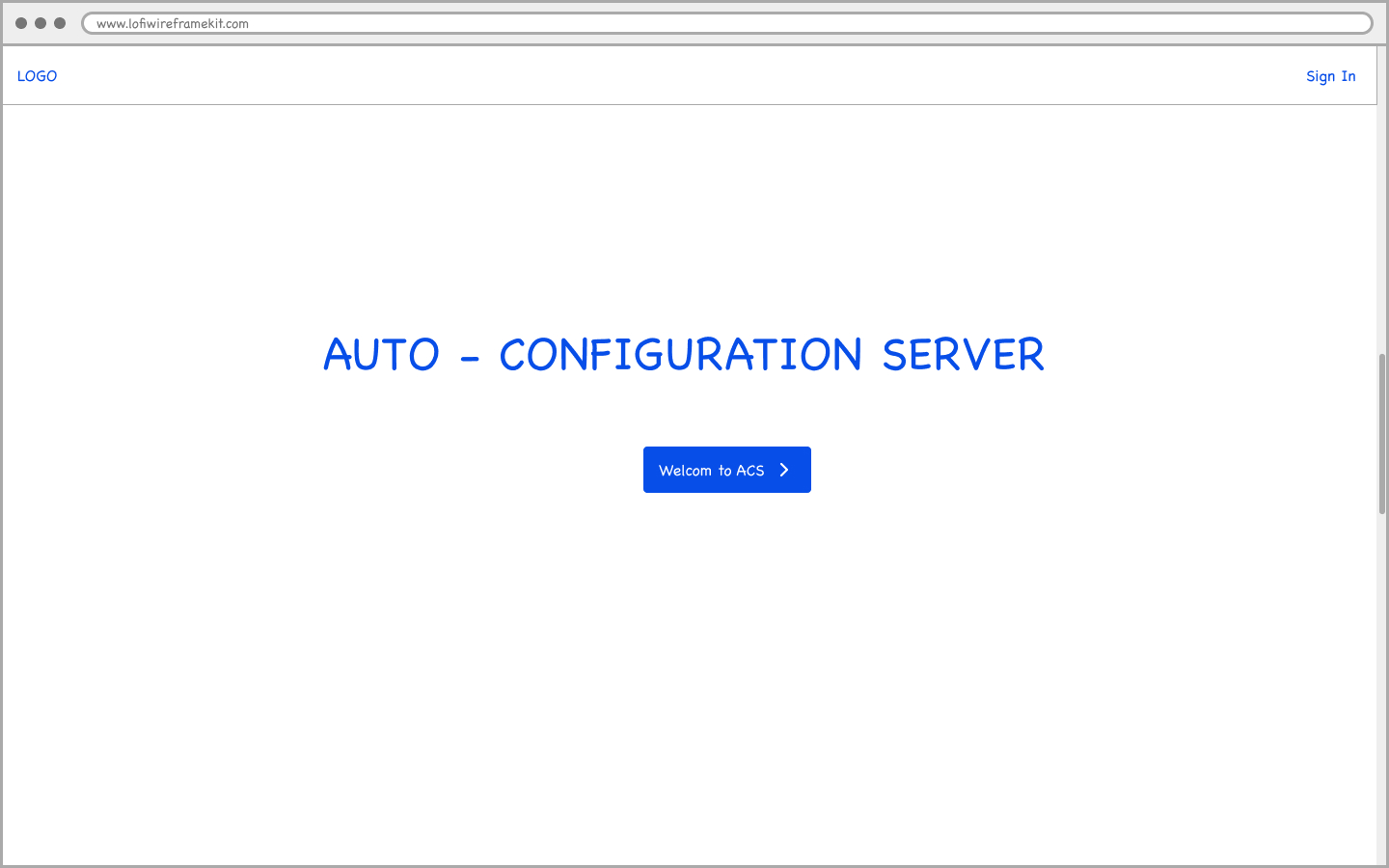
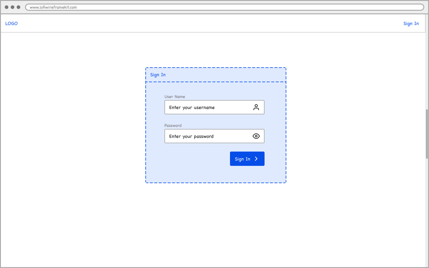
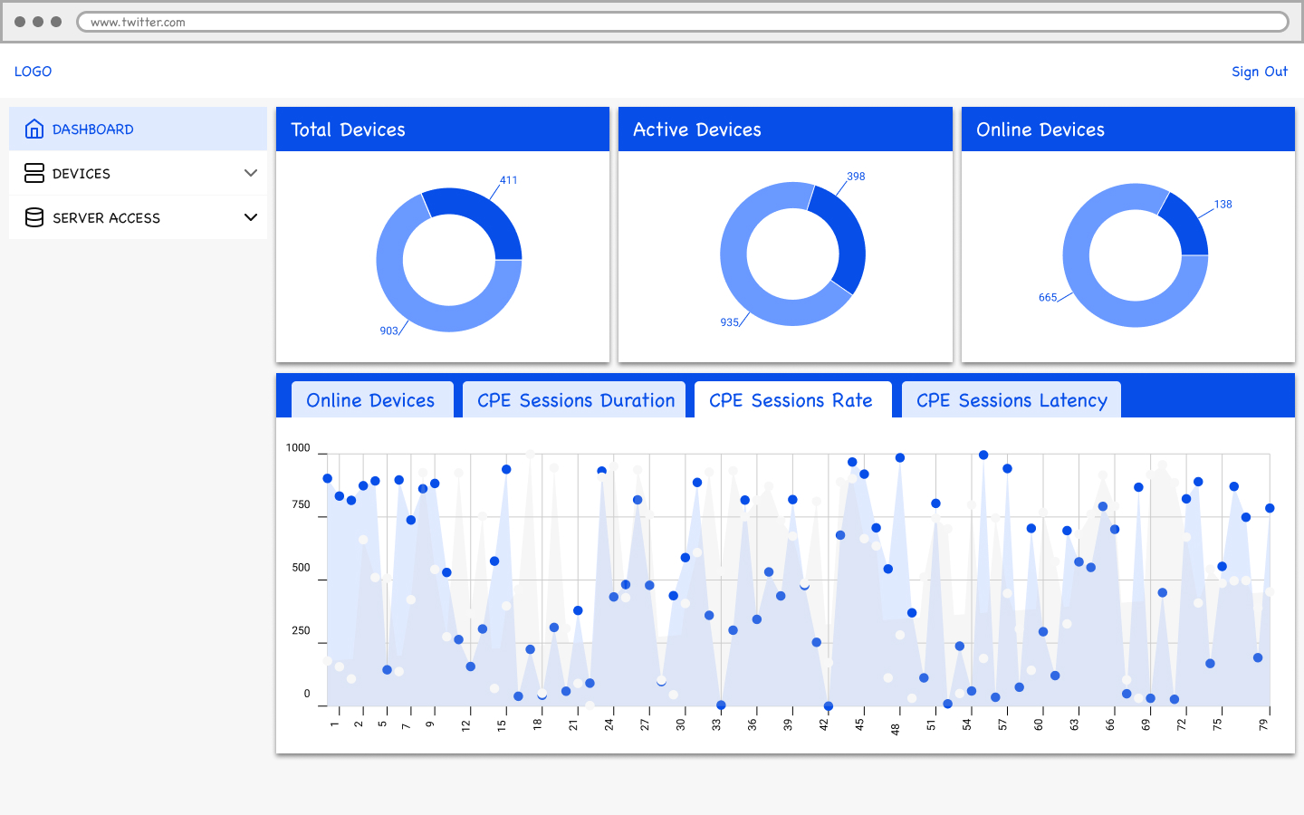
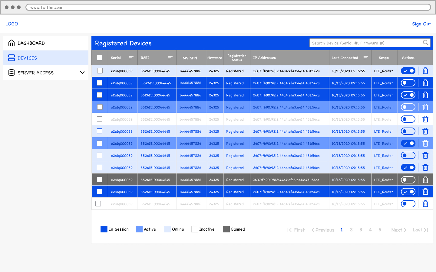
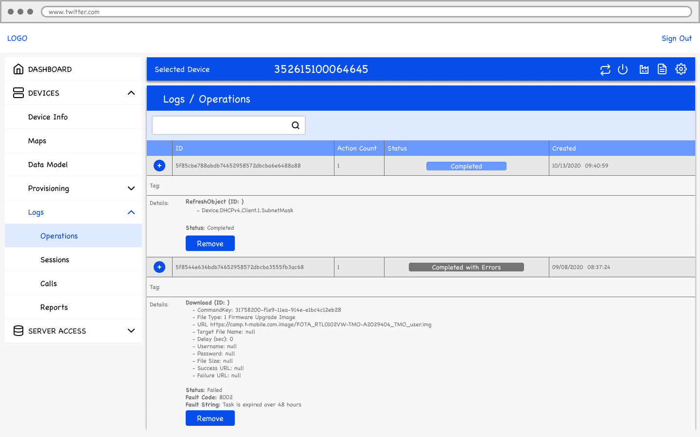
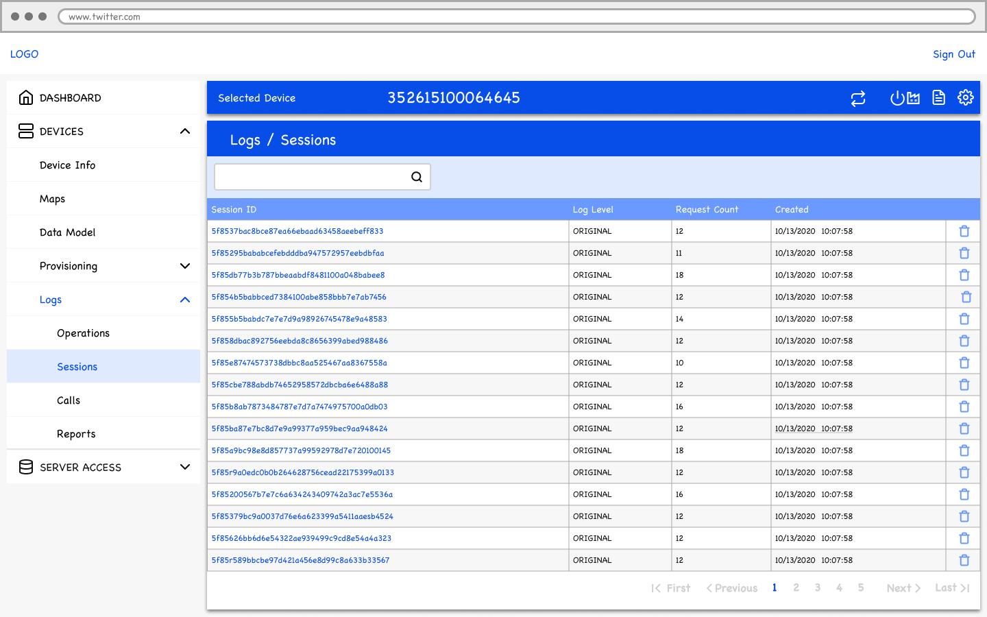
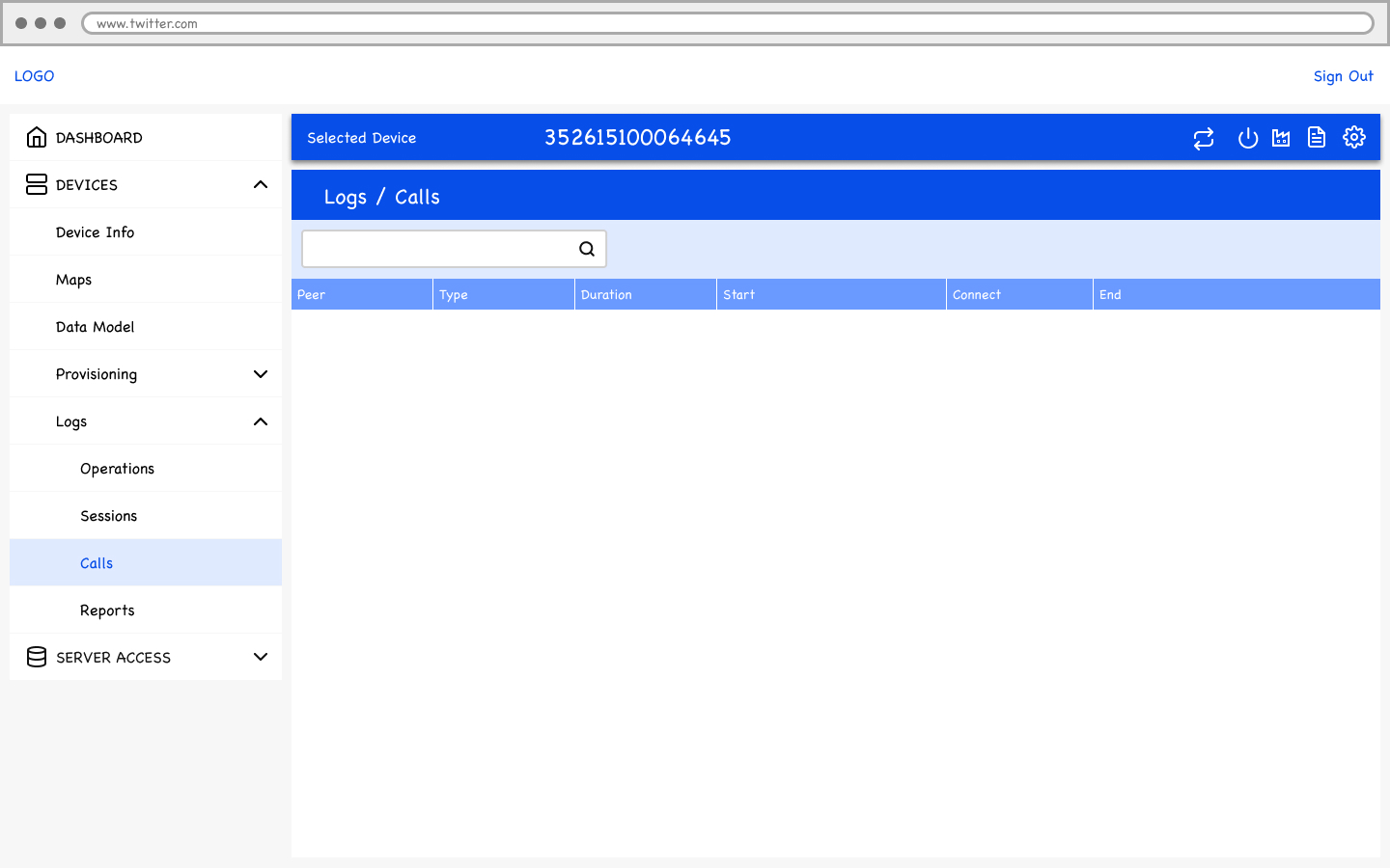
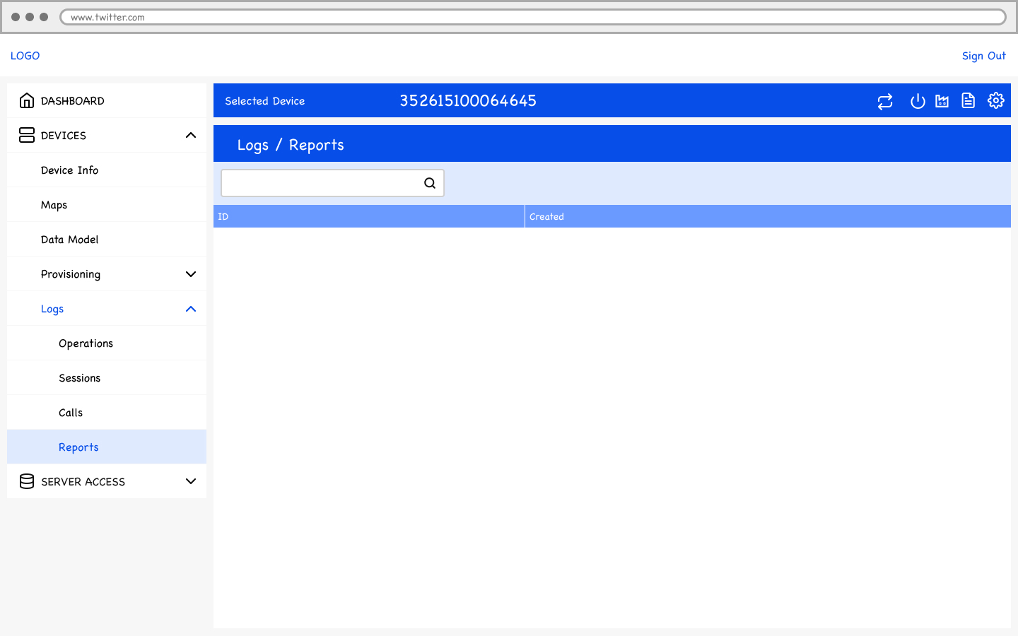
We focused on simplifying the platform while ensuring that essential functionalities were accessible. To visualise the new workflows, we created low-fidelity wireframes, followed by high-fidelity prototypes that incorporated feedback from T-Mobile stakeholders.
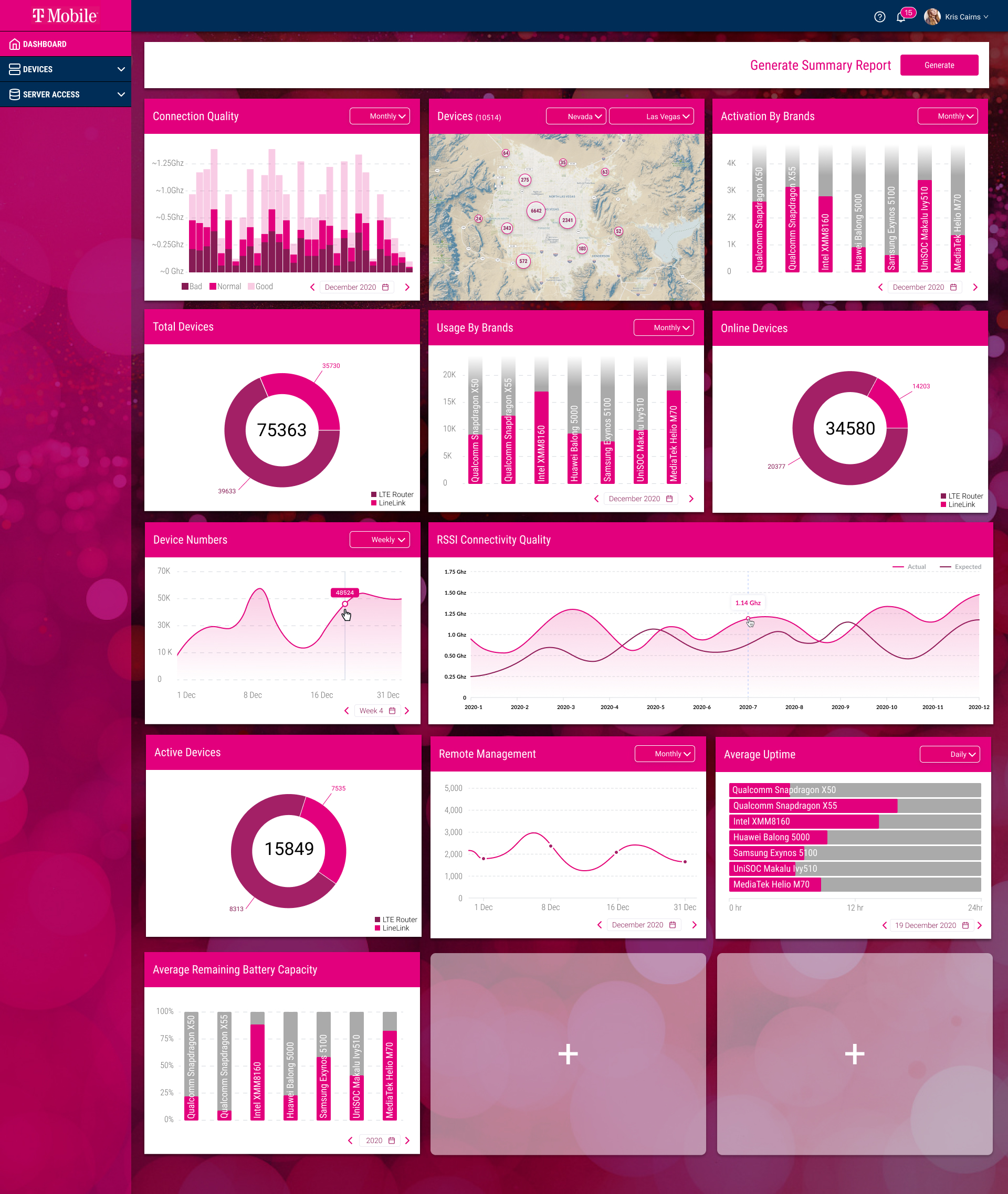
- Dashboard Redesign: Centralised critical device management metrics, providing a bird’s-eye view of the entire device network.
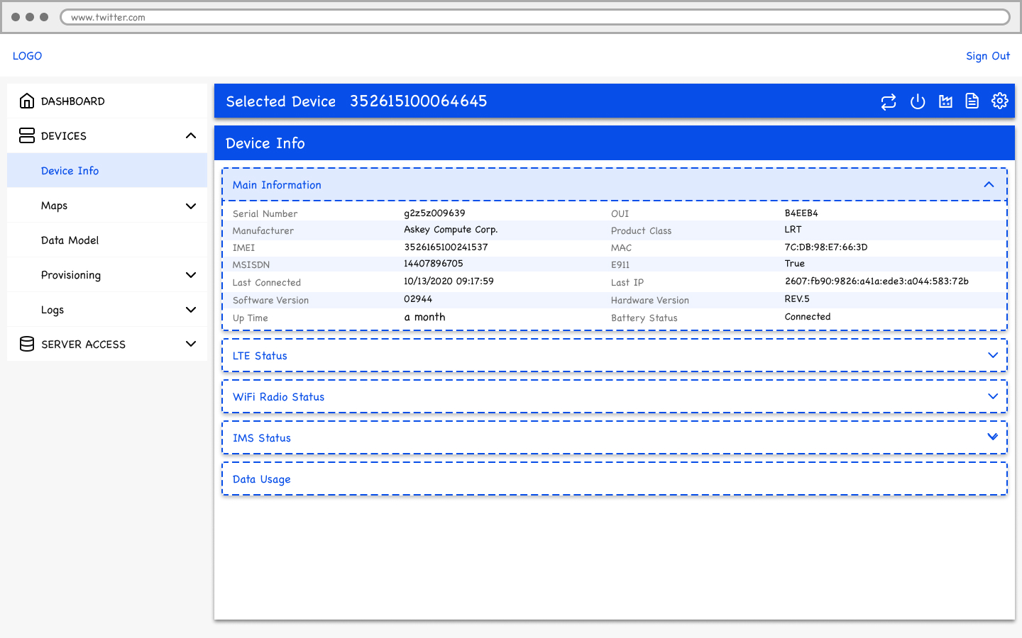
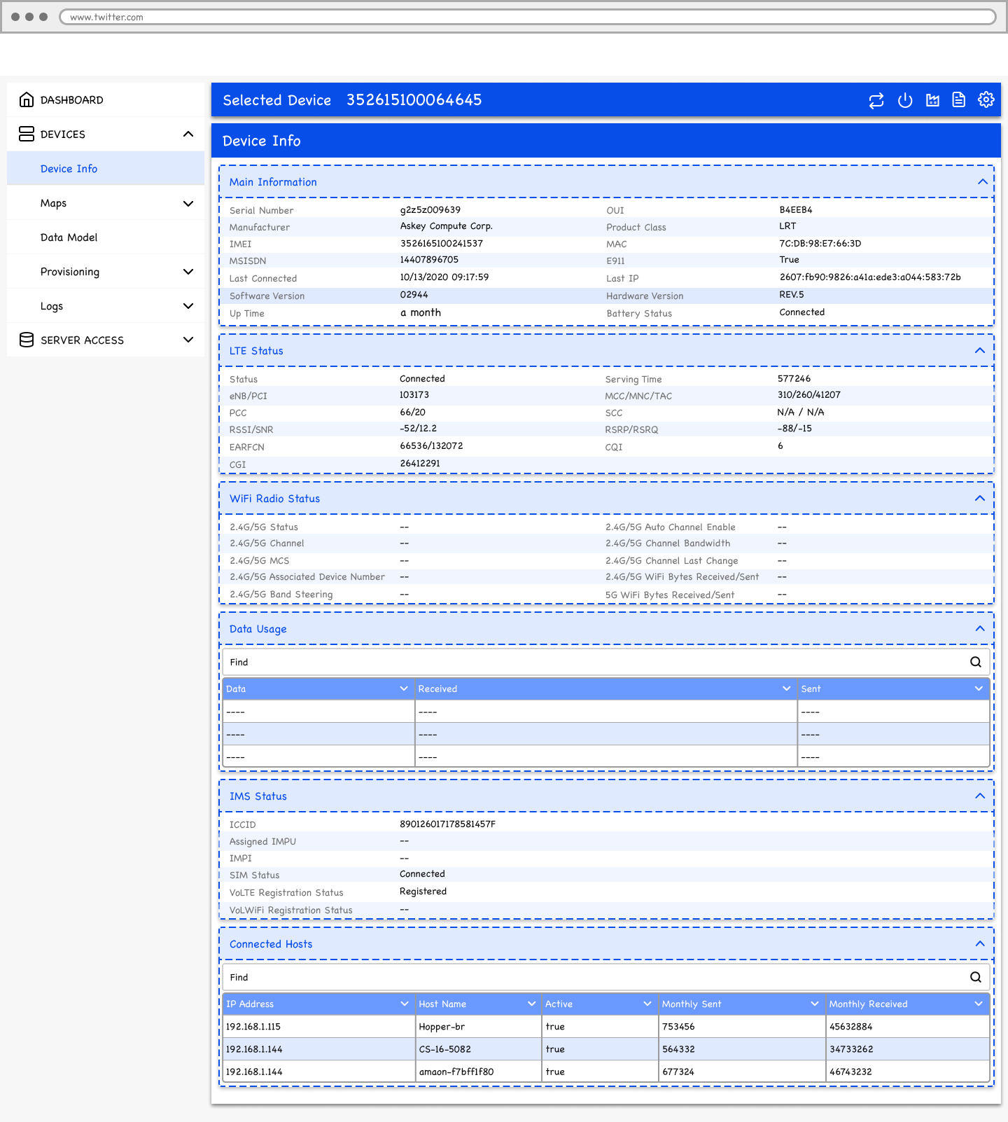
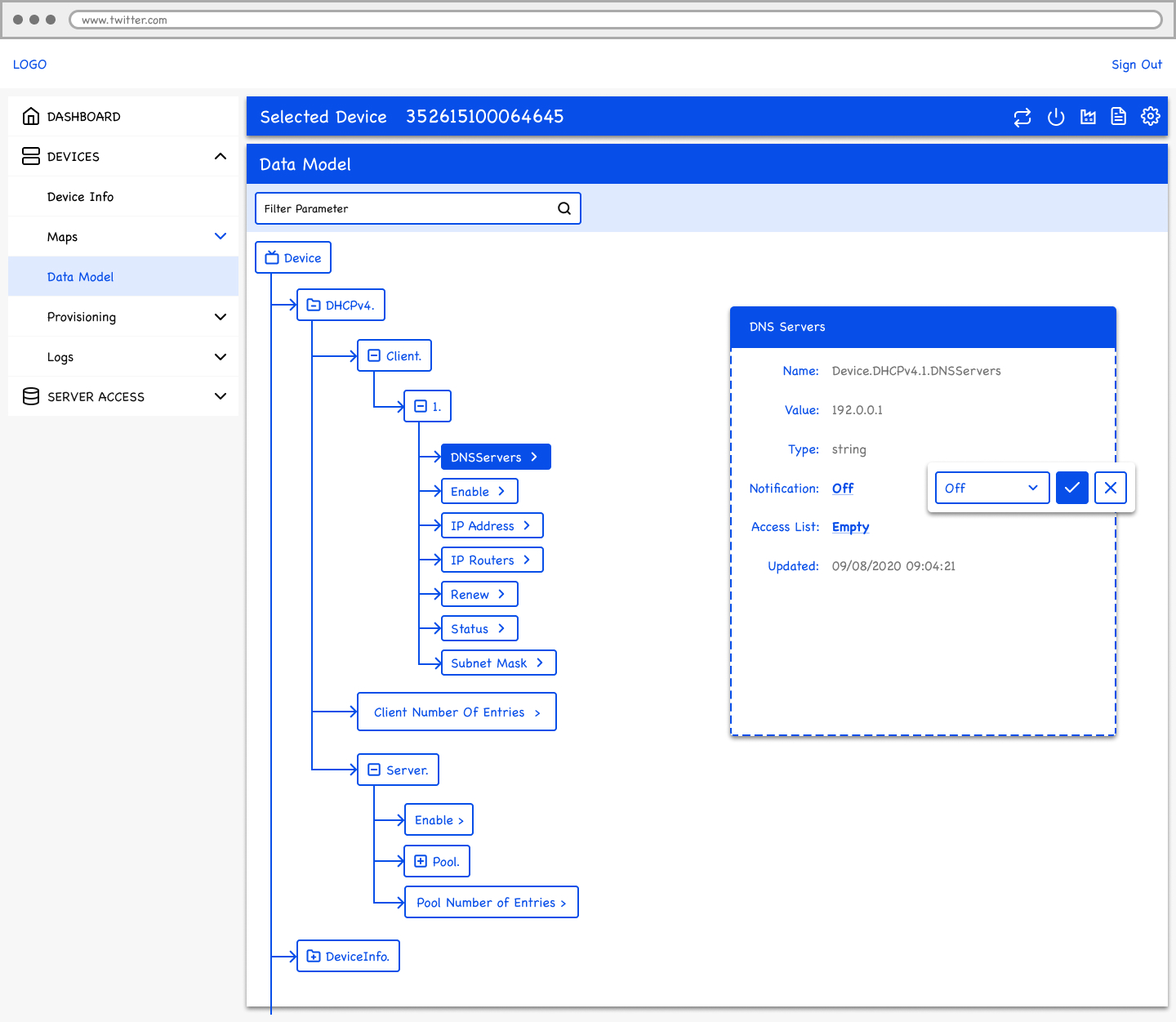
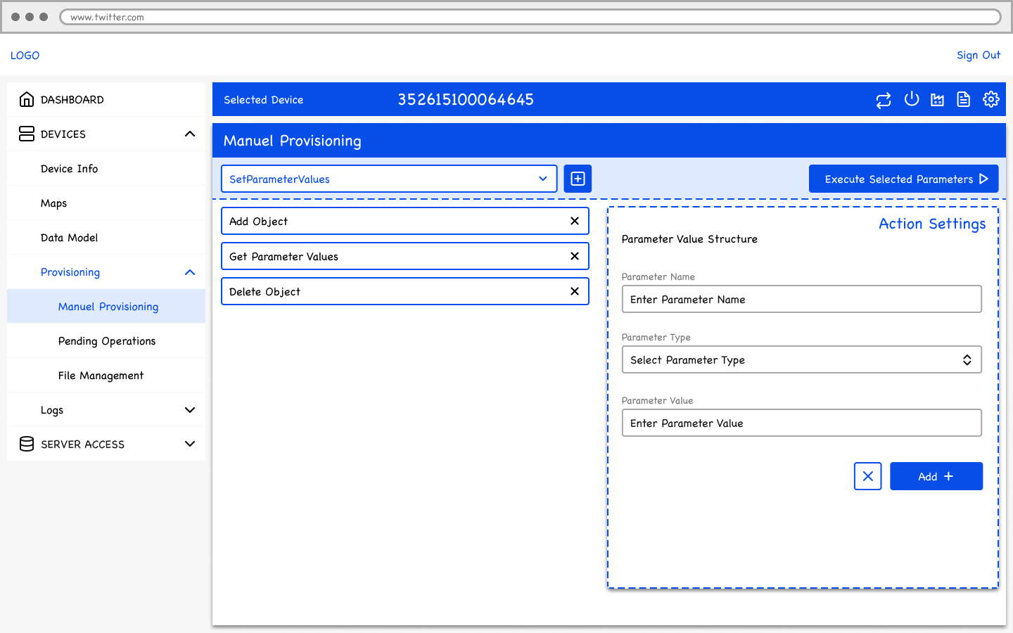
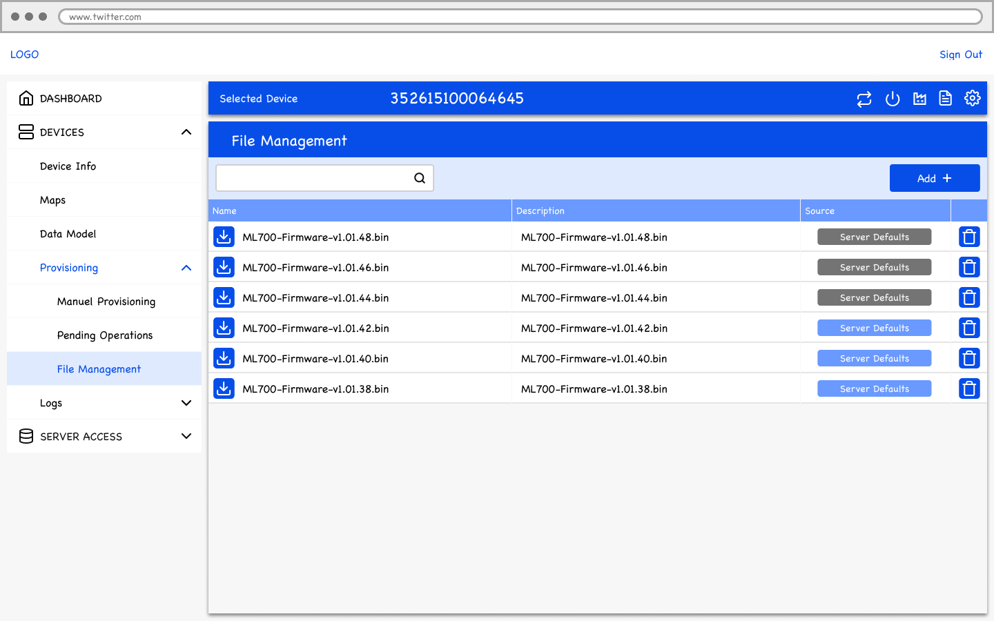
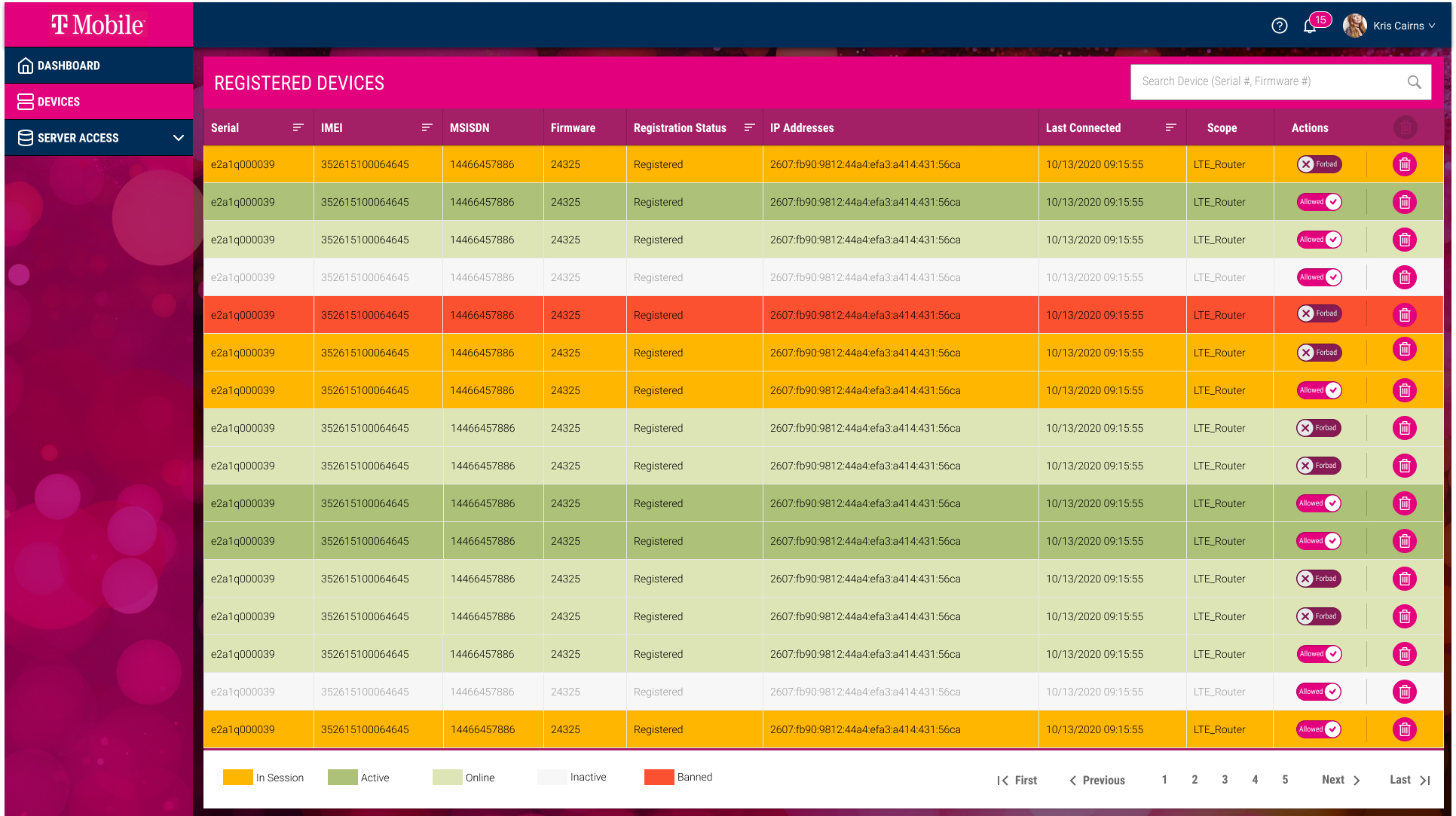
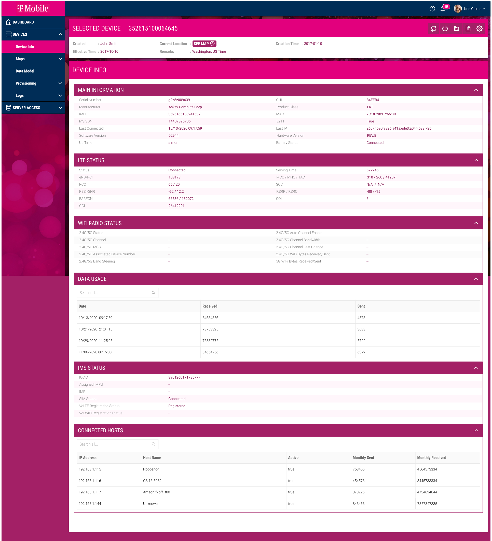
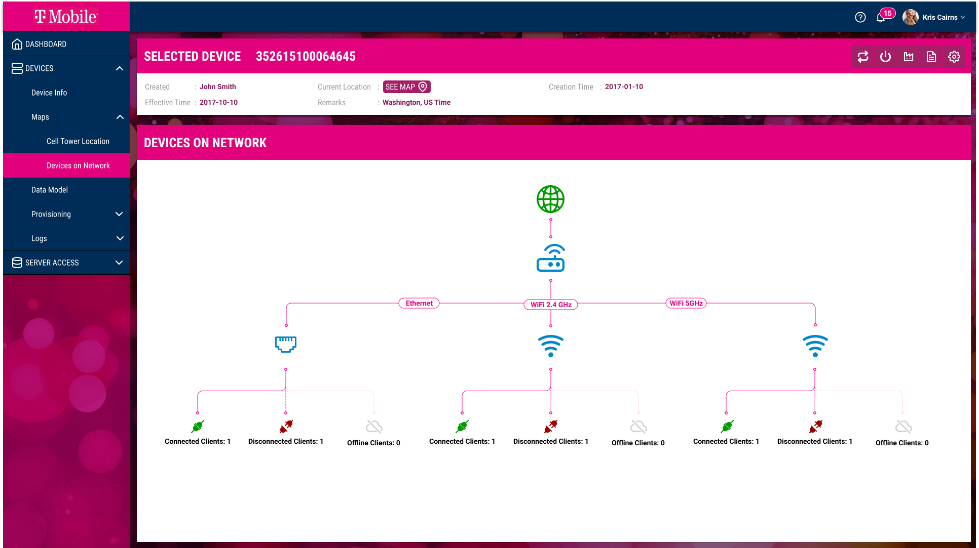
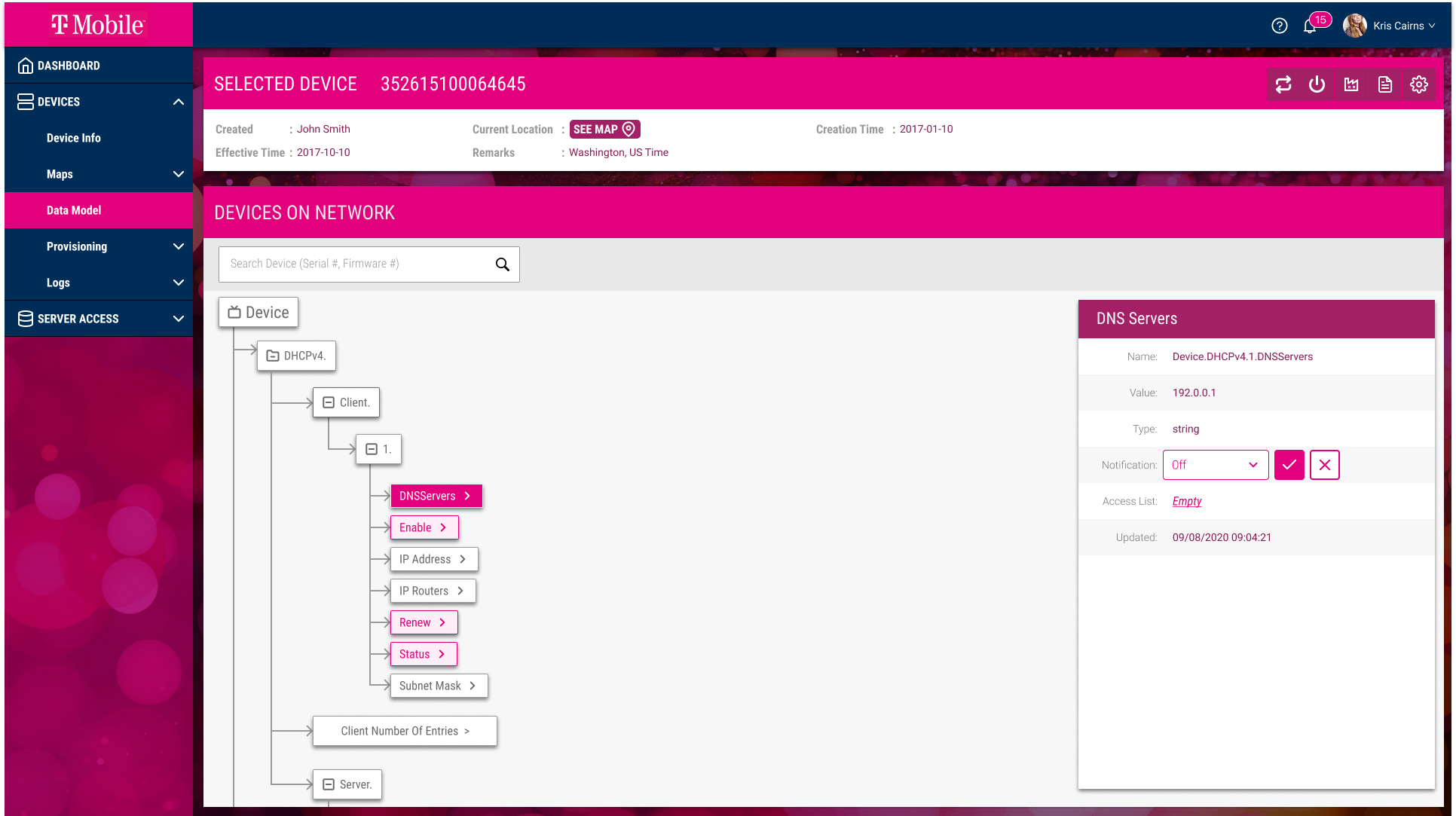
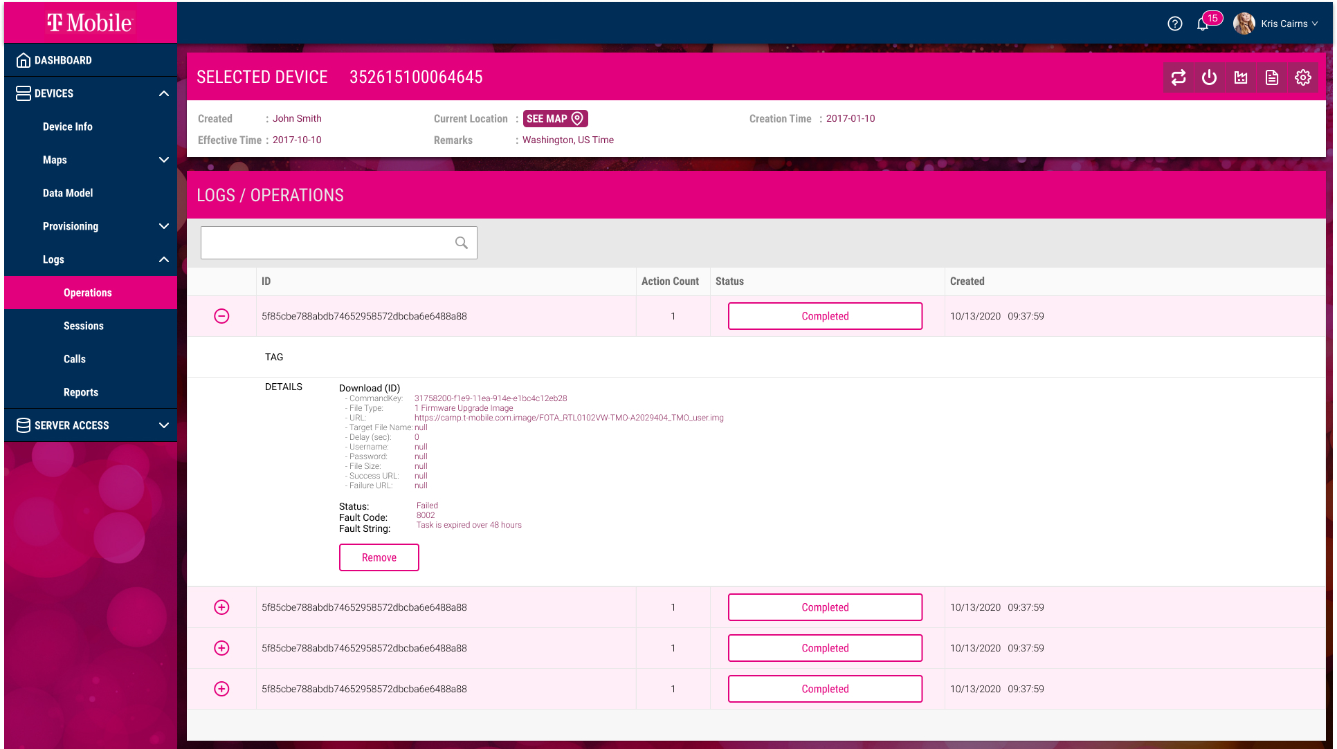
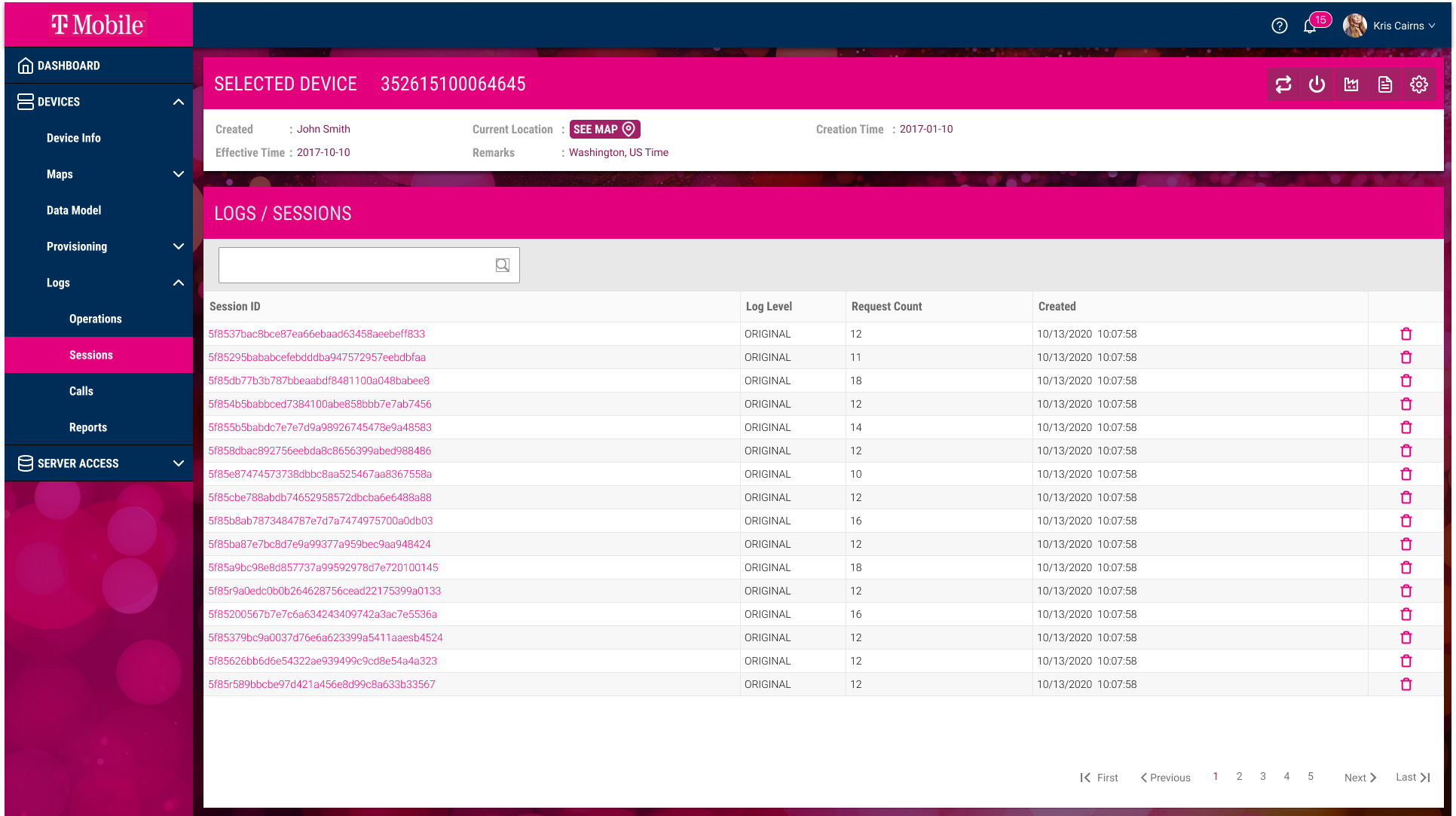
- Device Management Flow: This flow simplifies the process of viewing, configuring, and monitoring individual devices, allowing users to complete actions in fewer steps.
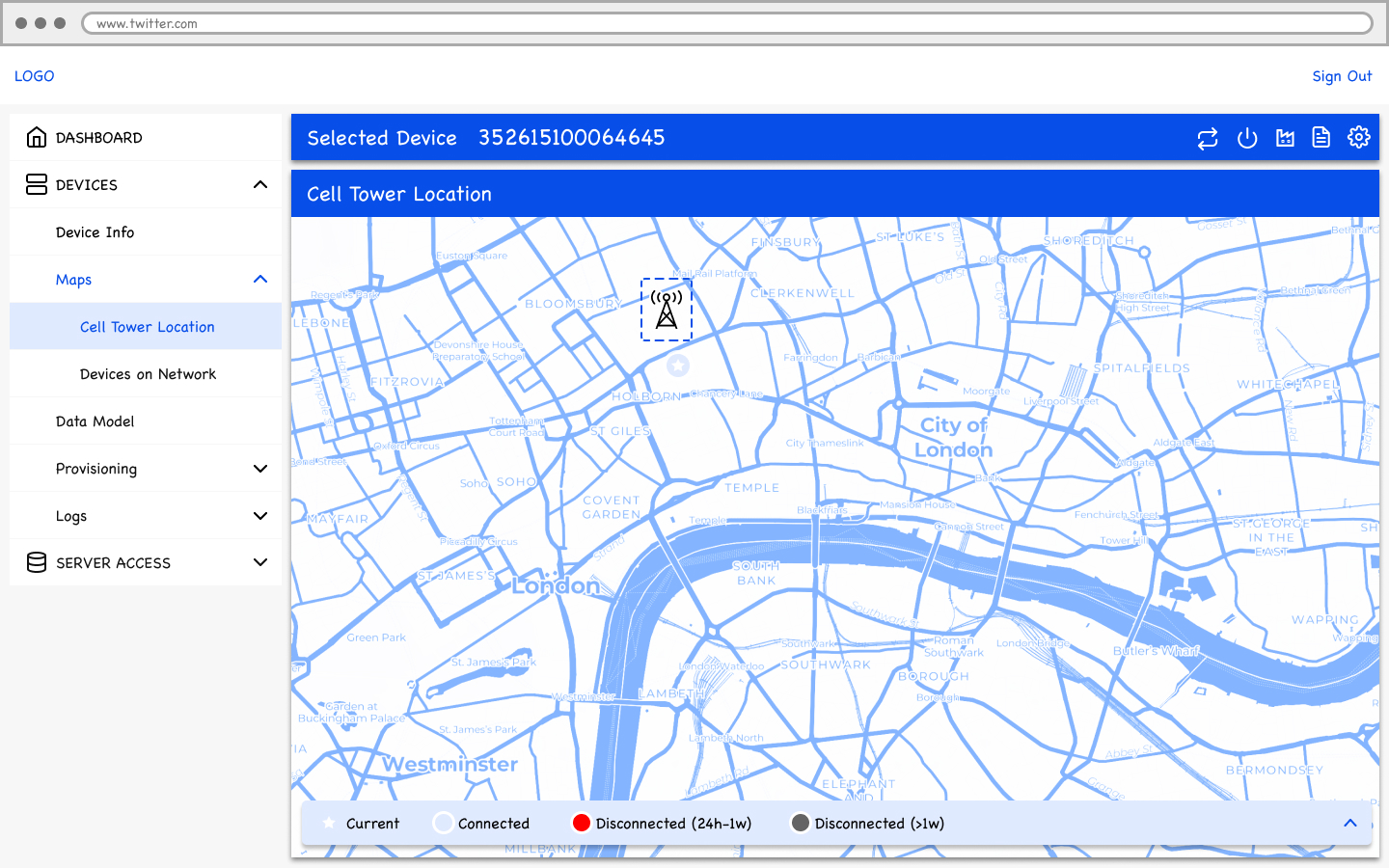
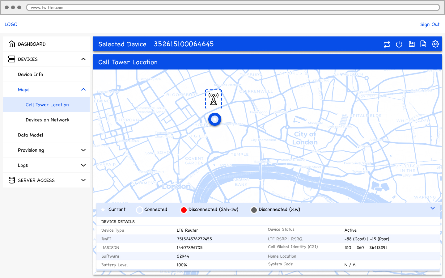
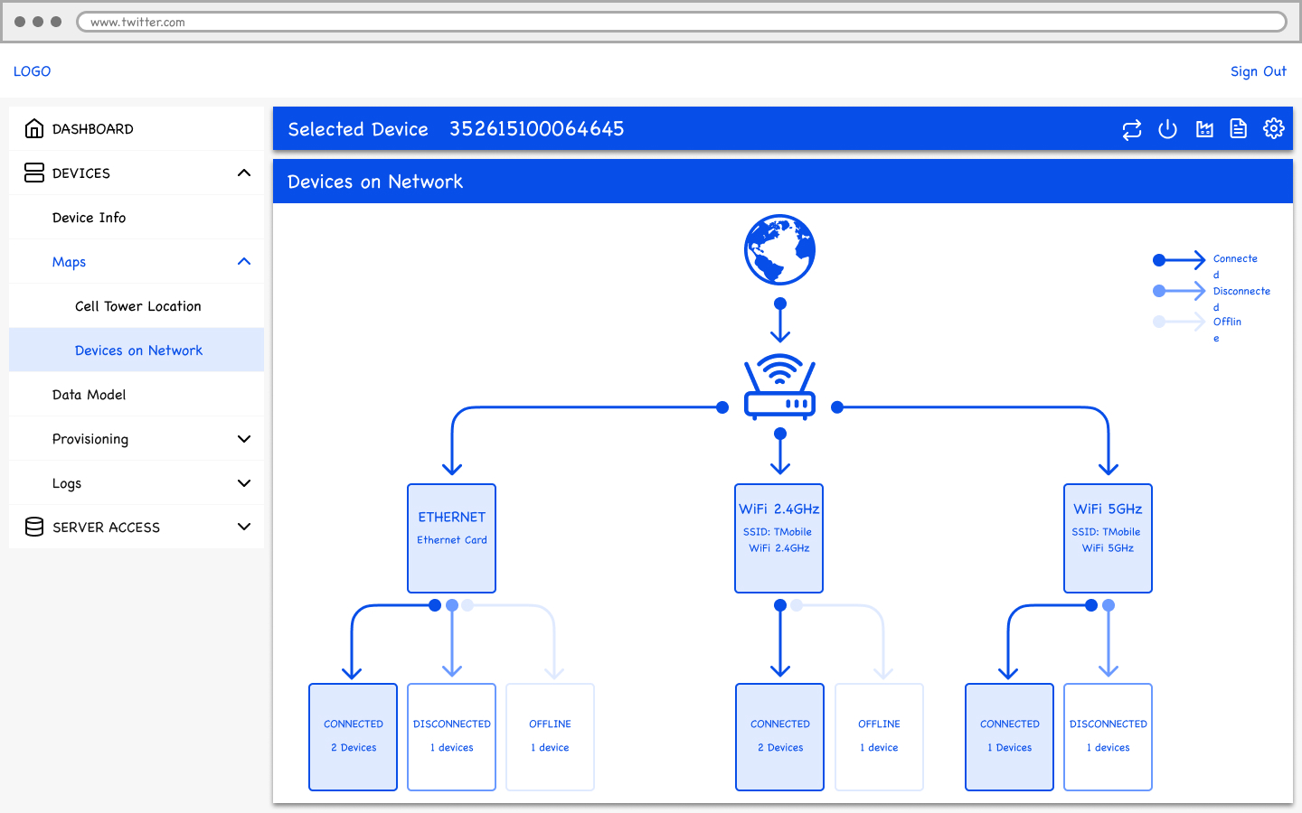
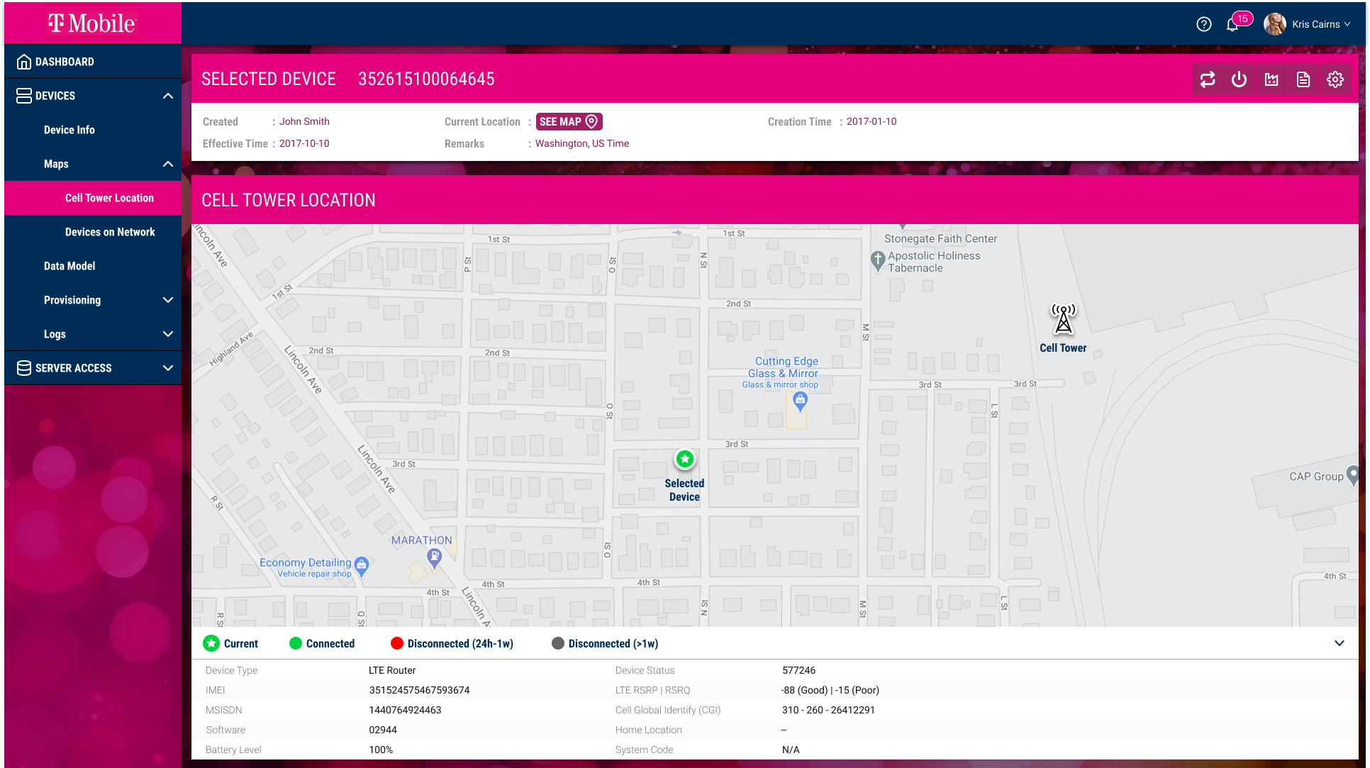
- Map Integration: Included a map to display devices and cell towers, making geographical management more intuitive.
The interface took a minimalist approach, focusing on clarity and functionality. Colours were chosen based on T-Mobile’s design principles and were applied to maintain consistency.
We conducted user testing sessions with network operators to improve the platform’s usability. Iterations focused on improving task flows and ensuring the interface was intuitive for new and experienced users.
Impacts
The project resulted in significant improvements across various metrics. Task completion time for activities like device provisioning and monitoring was reduced. Post-launch interviews revealed increased satisfaction with the updated platform. Additionally, more straightforward workflows led to a decrease in user-reported errors during device management tasks. This project emphasized the need to balance complex functionality with ease of use.
