Project Definition
Bayer is a German multinational company specialised on pharmaceutical and life sciences. It is one of the largest pharmaceutical companies in the world. Bayer has a strong focus on research and development of the hemophilia treatment.
Hemophilia is an inherited genetic disorder where the body loses control to stop bleeding caused by stress or any trauma. Deficiency of clotting factor VIII leads to Hemophilia A and the basic treatment prevailing in the market is to replenish the body with factor VIII. Replenishment is done by either preparation of recombinant factor VIII or from plasma-derived factor VIII. The global market of Hemophilia is expected to grow by 5.6% annually between 2013 and 2024 and the competition is getting intense with various new players emerging in with better strategies for the treatment.
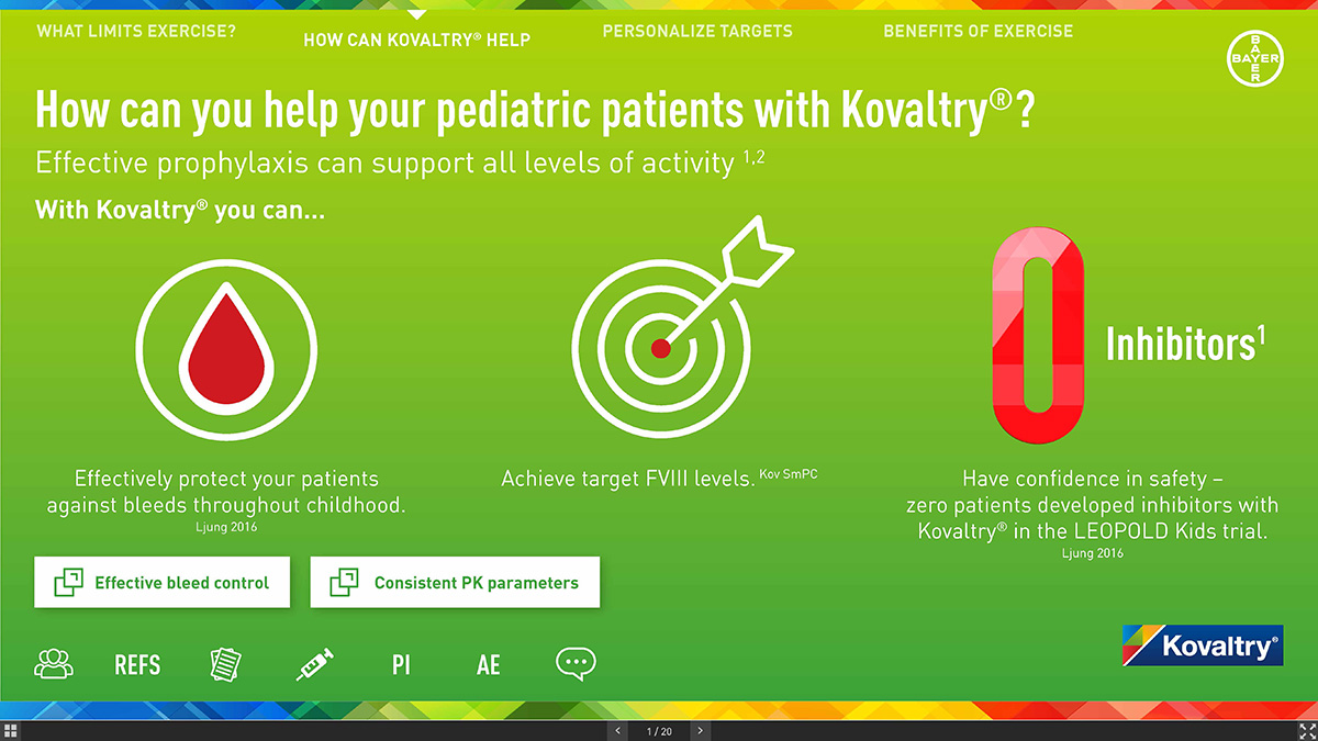
KOVALTRY® is a medicine used to replace clotting factor (Factor VIII or antihemophilic factor) that is missing in people with Hemophilia A. This product is used to treat and control bleeding in adults and children with Hemophilia A. KOVALTRY® can reduce the number of bleeding episodes in adults and children with hemophilia A when used regularly (prophylaxis).
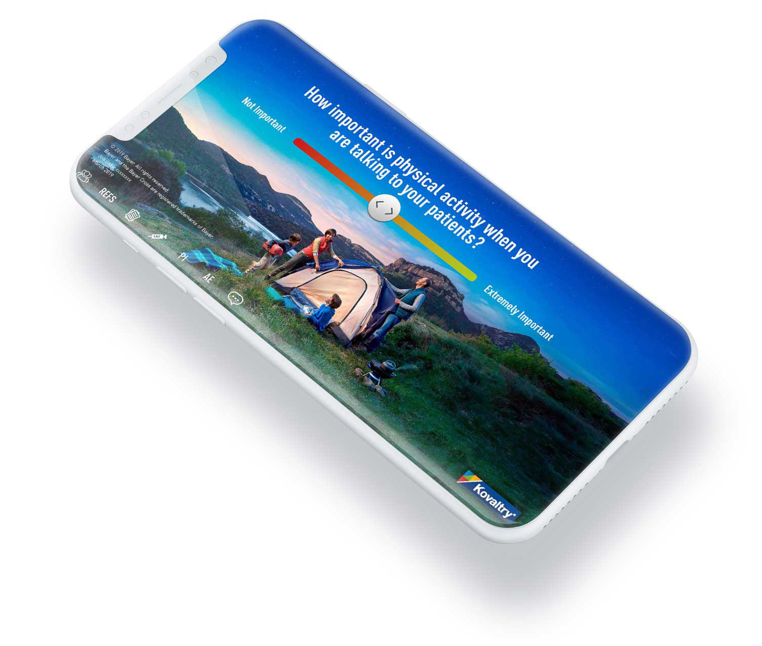
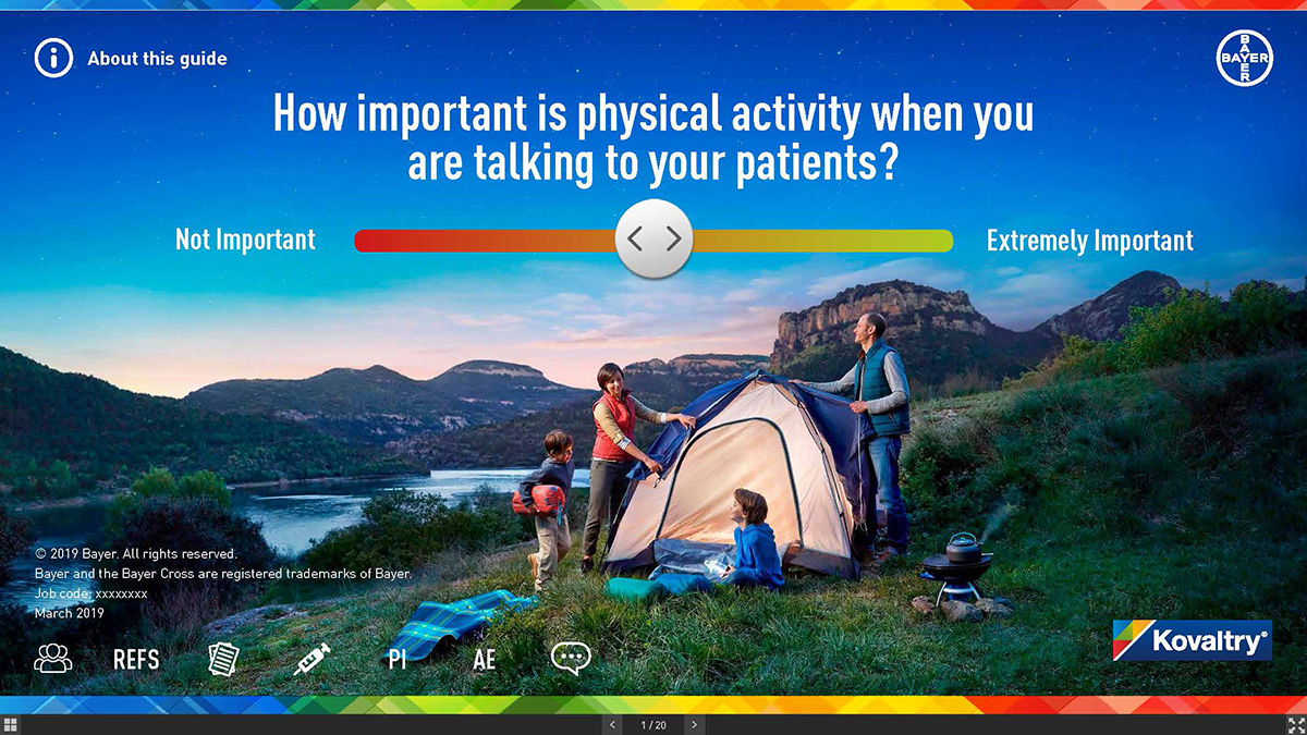
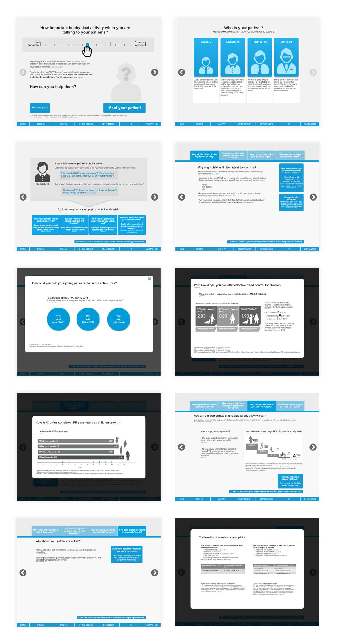
Bayer requested to design a tablet-based application which educates users about Bayer’s drug KOVALTRY®. This tool will be used by sale representatives.
The Challenge
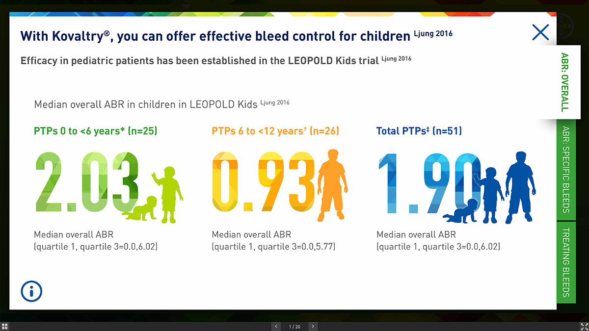
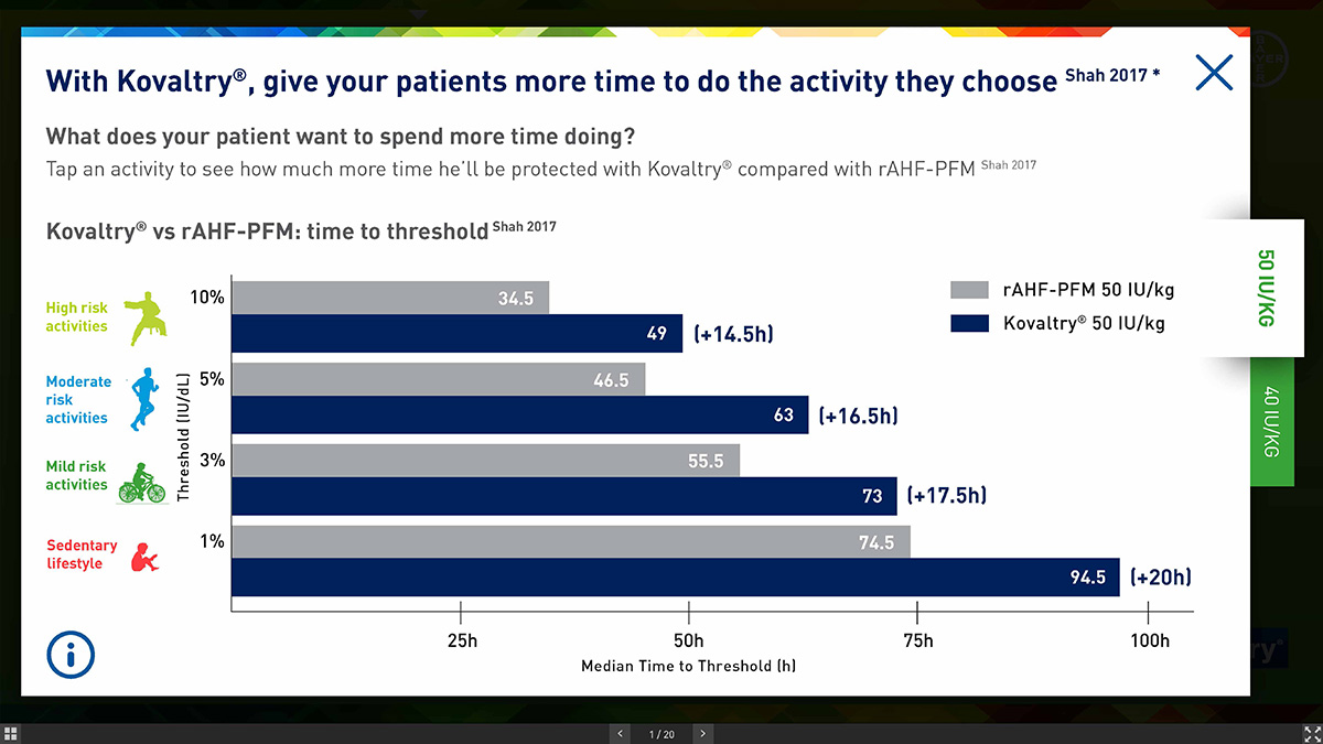
Products offer fewer infusions and more steady state and this results in less efficacy. Patients want to be more active in their daily life and many of them will infuse more frequently to achieve this. This results from problems on controlling bleeds. We had to represent the effectiveness of our product on bleeds that supports patients activities. This was one of our unique selling points.
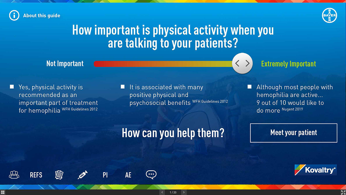
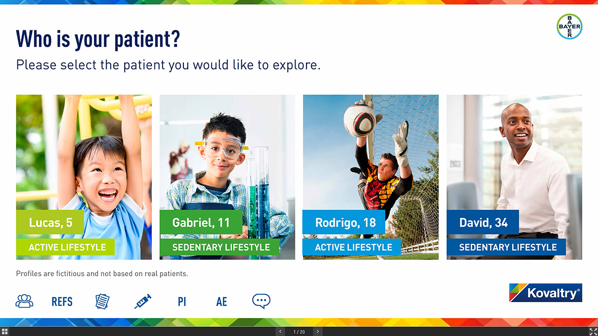
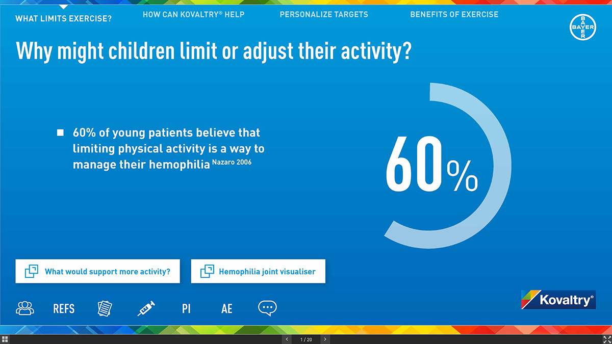
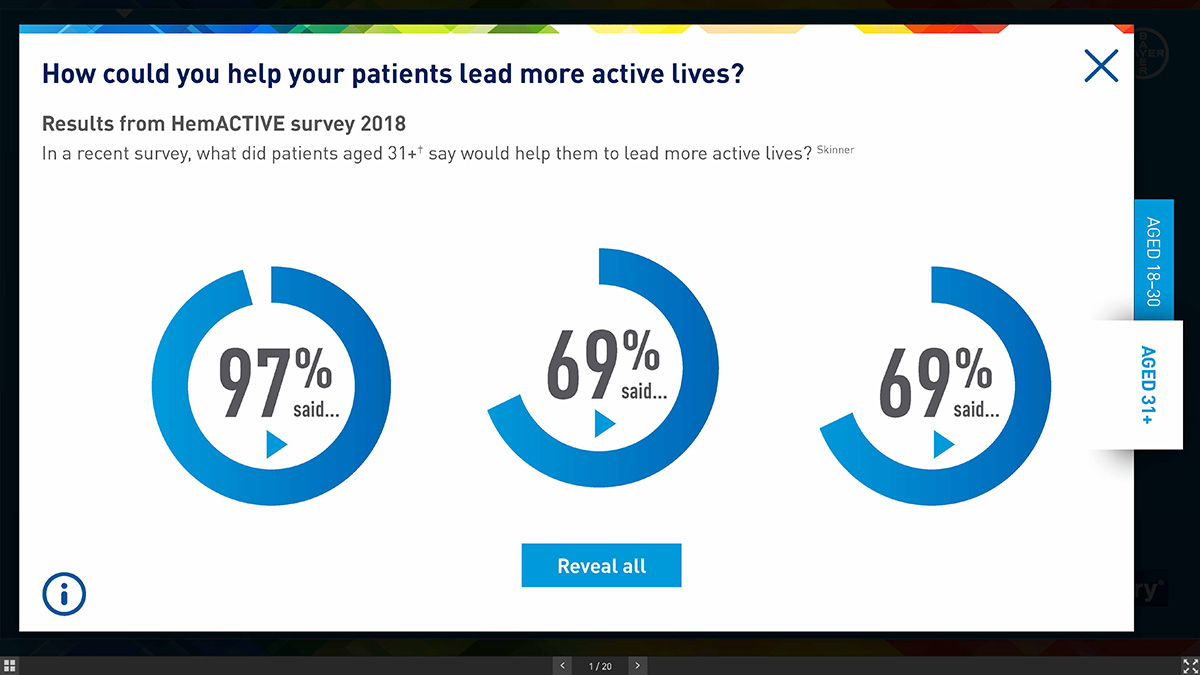
A large number of patients, particularly highly active patients inject more than limit themselves in their level of activity and lifestyle. A mom would rather give the child an extra injection than have them miss out. Also, a lot of patients are limiting their physical activity as a way to manage their hemophilia but want to be more active and strive for a normal life.
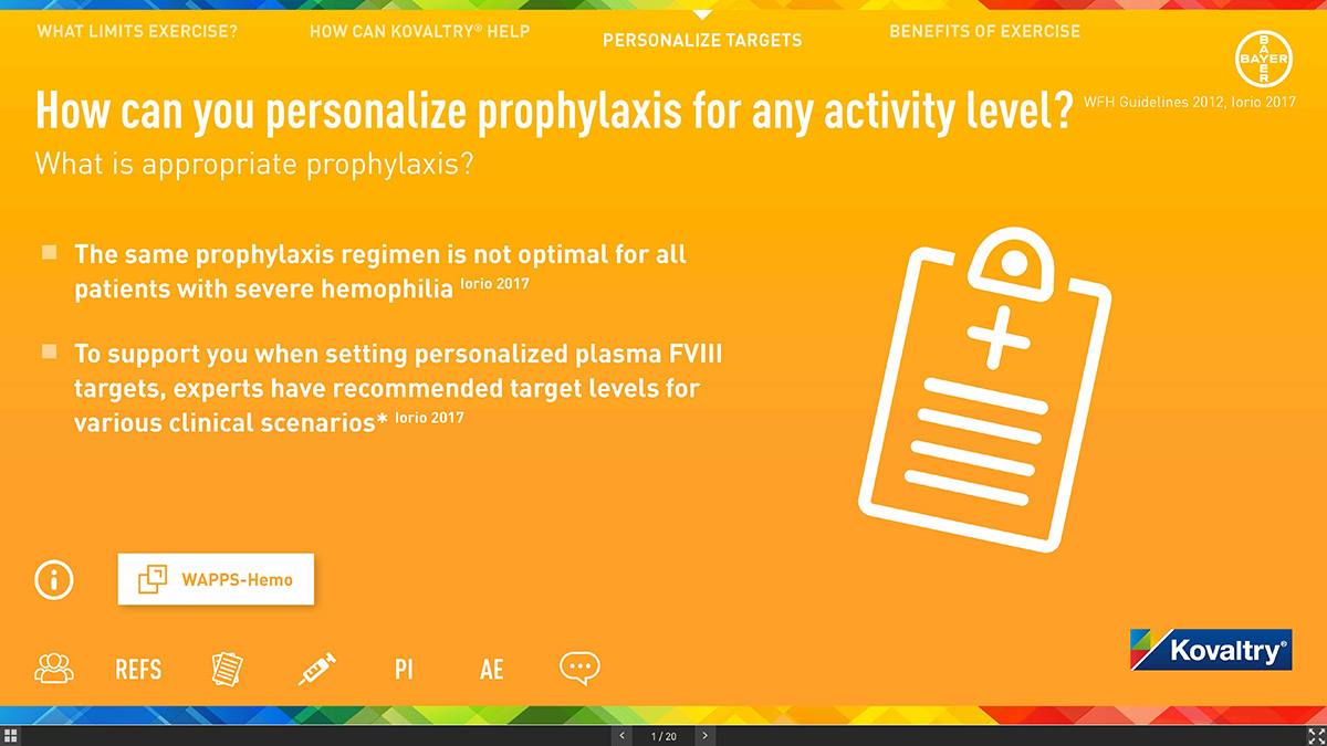
Appropriate prophylaxis with rFVIII can support all levels of physical activity. A recent expert consensus has been generated to help tailor treatment to patient needs by determining target FVIII levels for specific patients based on their desired activity. We should help HCP to make them confident about their treatment process that can adopt to patients needs and life style.
My Role
As a user experience design consultant, I started from scratch by understanding customer insight and content framework, taking the responsibility of user experience design process, making a contribution to strategising, conceptualizing, designing and delivering the hand-offs to the developers working for multiple platforms.
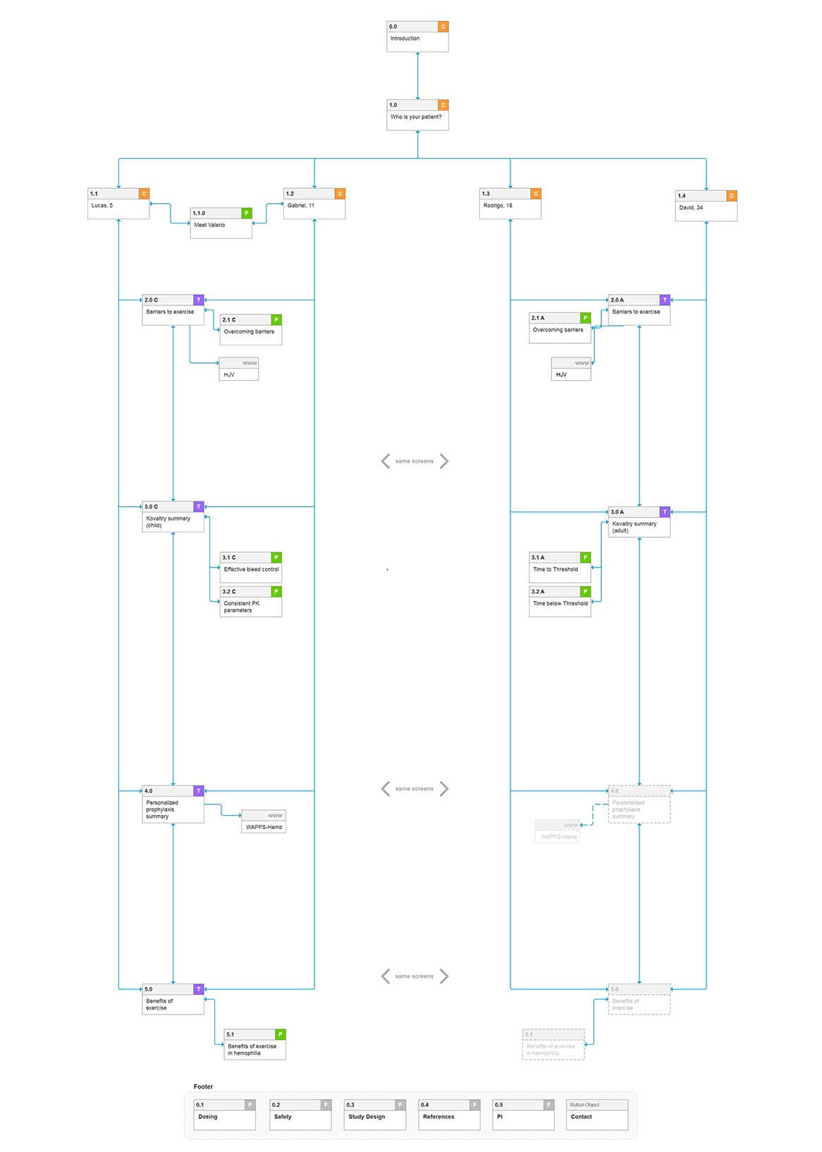
My primary responsibilities included designing information architecture based on the content framework, wireframing low fidelity designs to prototyping high fidelity designs and collaborating with the project managers, account managers, subject matter experts, UI designers and outsourced developers.
The Approach
In today’s healthcare area, competition is fierce and there are strong players who have been leading the race and competing head-on in the Hemophilia market. Having a good product is no longer enough.
Sales representatives are the key actors in this competition and they must be capable of selling not only your product but also of set themselves as strategic advisors capable of helping solve their prospects’ and healthcare professionals’ treatment problems.
A sales rep must focus less on transactional sales and more on building long-term relationships with their clients. So, we need to develop the flow and content structure inorder to support sale representatives.
Problems and Solutions
Our product released for tablet and mobile devices. Contents successfully adapted both HCPs and Sale Reps usage. In order to promote the product and sharing information about the treatment process, this application is going to be used pharma related congresses. We tried to create a minimalistic visual language with vibrant colours, animations and simple interactions in order to maintain content easy to understand and remember.
