Project Definition
Bayer is one of the largest pharmaceutical companies in the world. As a German multinational company; Bayer specialised on pharmaceutical and life sciences. Bayer has a strong focus on research and development of the haemophilia treatment.
Haemophilia is a genetic disorder that affects the body’s blood-clotting ability, which can lead to excessive bleeding. This genetic defect is inherited recessively on the X chromosome, that means the majority of patients are men. The patients suffer from lack a protein that causes the blood to clot as part of the natural wound-healing process. In haemophilia A, which affects 80-85 per cent of patients with haemophilia, it is the blood clotting Factor VIII protein that is lacking. Severe haemophilia is portrayed by spontaneous bleeding into joints, muscles and various organs, even if there are no external injuries. This bleeding can lead to permanent disability or even death at any age.
Existing treatments for haemophilia-A based on providing the missing FVIII for the patients prophylactically. The primary goal is to avoid spontaneous bleeding episodes. However, in this replacement treatment, stability and activity of the artificial FVIII in the blood reduced by the time and frequent infusions can affect a patient’s quality of life. Jivi is designed to overcome this obstacle by the addition of PEG, or PEGylation, a substance that, once connected to FVIII, improves its stability and significantly lengthens its half-life in the blood compared with other currently available therapies.
Bayer requested a design of a website that helps HCP (Healthcare Professionals) about treatment processes based on JIVI. Our scope of work covered user experience, content creation, visual design and project management.
The Challenge
The pharmaceutical companies are currently suffering through public relations. News related to drug companies is generally negative. Perception of these companies among consumers and the general public creating pressure. According to surveys, only 33% of the public opinion about these companies are positive. This is the lowest level in all industries. According to public perception, pharmaceutical companies are trying to maximize their profits by increasing prices of existing drugs and not creating new and effective drugs. The research and development within the pharmaceutical industry have been declining in recent years. Today, creating a new drug like Jivi can cost up to £1.5 billions. Increased research and development costs, additional regulations and marketing related costs are some effective reasons for this big cost. Under these circumstances and market facts, we need to create a solid content framework for the Jivi branded website and give a complete set of information to the HCPs to make them empowered to upgrade their Hemophilia A treatment.
My Role
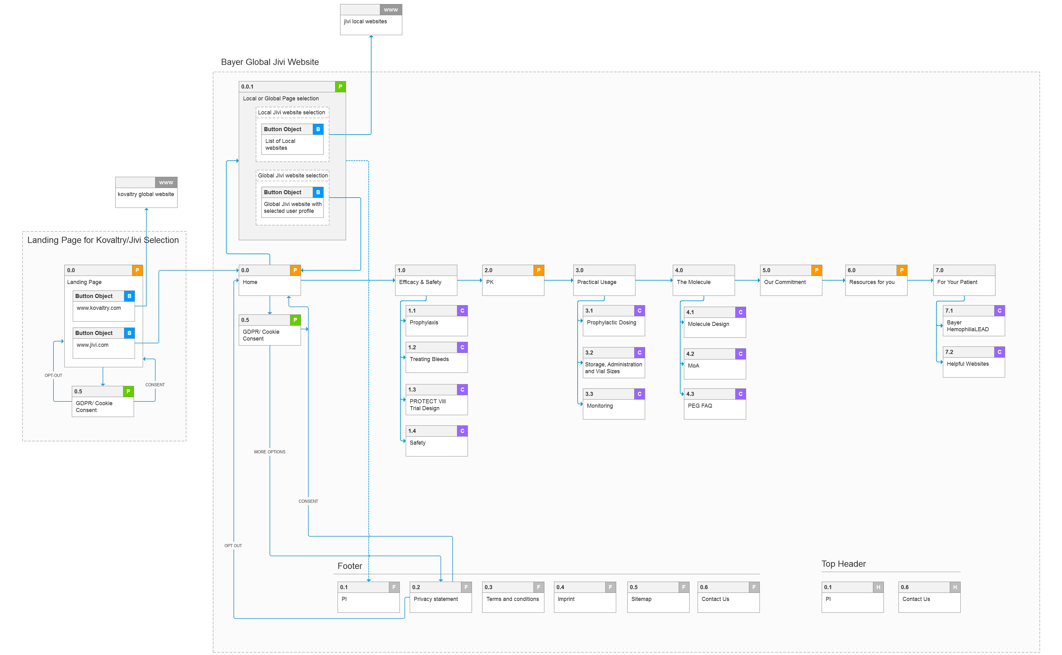
I was the leading user experience designer on this project. We started from scratch by researching, strategising, conceptualizing product content framework, creating an information architecture based on research outcomes, designing and delivering the hand-offs to the developers. My role is understanding the profile of users, their expectations, creating a consistent user journey based on the content framework and simplifying the navigation while being a contributor to the design process as a facilitator. I created a site map, user flows, wireframes, online interactive prototype, wrote functional specifications for design and user behaviour.
The Approach
Working with sale representatives, doctors, medical copywriters, SMEs and project manager, we conducted research about client’s previous product release experiences, explored patient and treatment-related problem areas, existing user segmentation and expectations.

Experience Strategy & Vision
Creating content structure was the major challenge for the team. From positioning the product, creating an awareness, motivational points for usage and creating a knowledge base for supporting product are the main problem areas that we are trying to bring our solution.

Customer Insights & Ideation
I partnered with the project manager and medical copywriters to uncover user (doctors and patients) insights and translate outcomes into content domain areas that address client expectations and user needs.
Design Execution & Validation
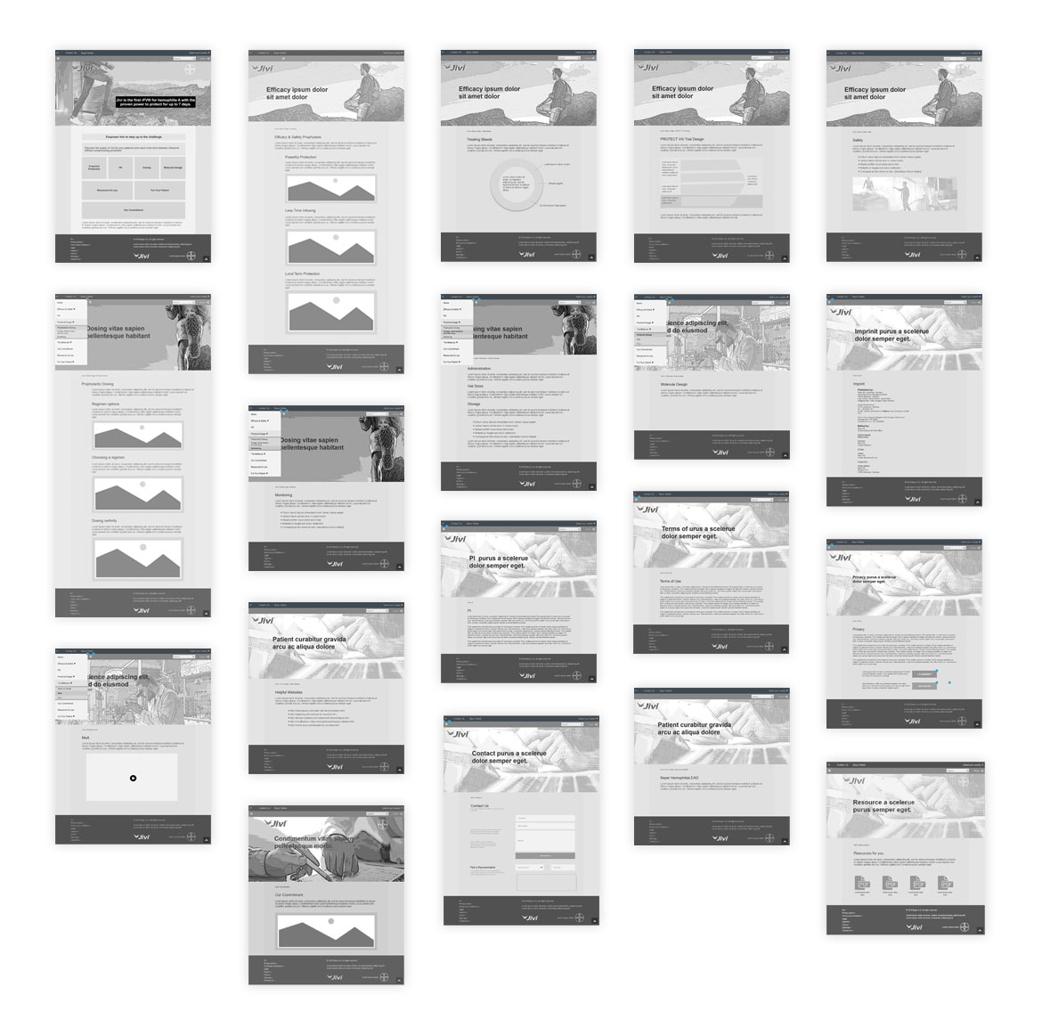
Based on our content approach, I created wireframes and an interactive prototype to share the vision, content structure and overall user journey. This was crucial for making proper communication with the client and potential users while discussing and testing the ideas, alignment and drive decision making.

Problems and Solutions
Through our interviews with internal and external stakeholders, we discovered that healthcare professionals were overwhelmed with statistical and technical information derived from pharmaceutical researches. So we focused on creating easily digestible content while making the website visually appealing. This is especially challenging for a new product to be released into a highly regulated sector. Not only because contents need to be clear and easy to understand, but also engaging to promote a product and information about the treatment process. While following Bayer’s well-structured design guidelines, we tried to create a minimalistic visual language for structuring the information and reduce the cognitive load.
Reflection
After successful implementation and numerous tests in order to tailor screens, our client remarked that they found the website to be friendly, and easy to understand by means of content, visual language, navigation, and colours.
