Project Definition
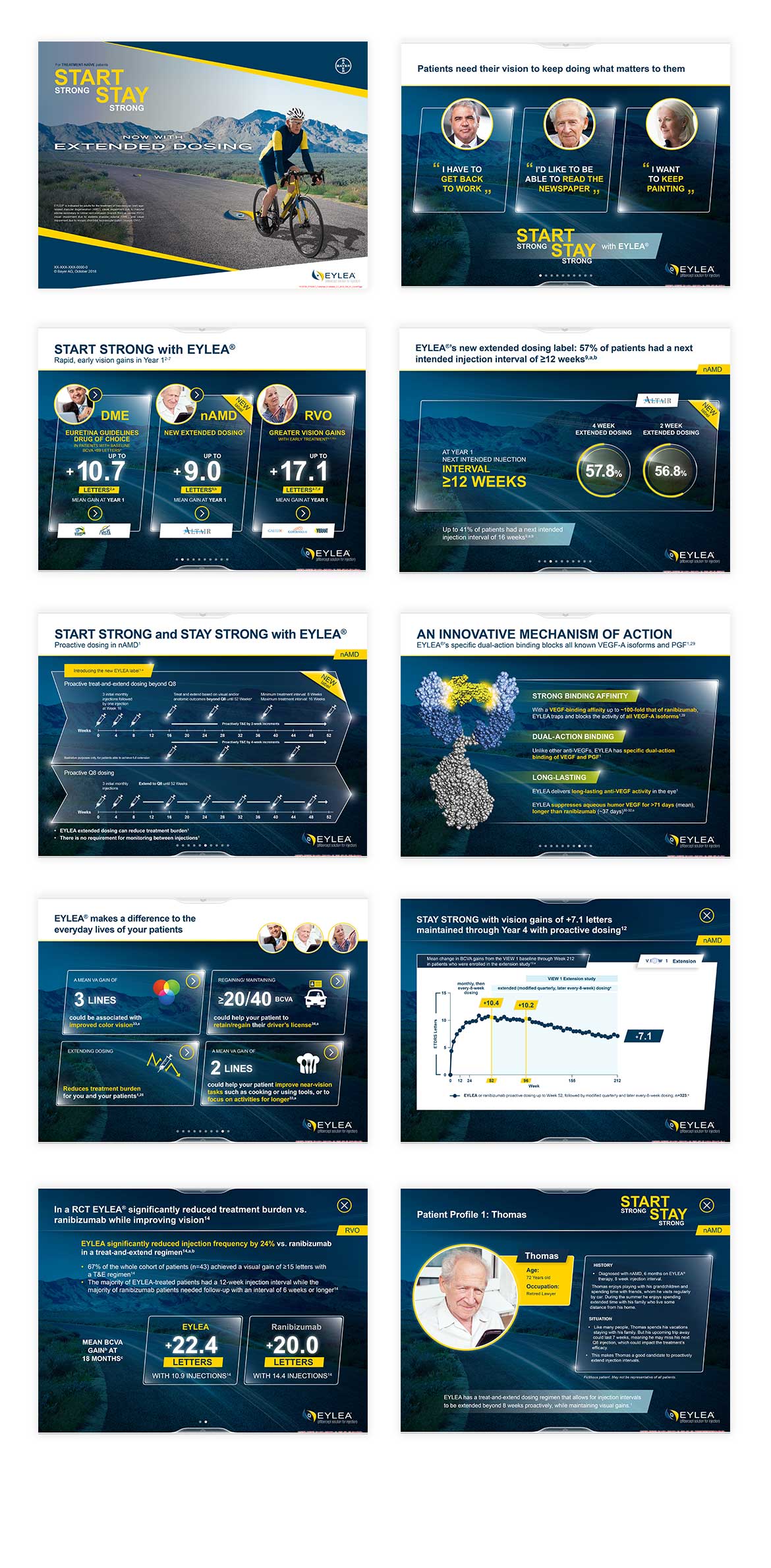
Bayer is a German multinational company specialised on pharmaceutical and life sciences. It is one of the largest pharmaceutical companies in the world. Bayer requested to update an existing iPad based application which educates users about Bayer’s drug EYLEA.
EYLEA is a drug for the treatment of patients with neovascular age-related macular degeneration (AMD) which is a disease of the retina of the eye resulting in loss of central vision. Visual impairment due to macular oedema secondary to Retinal Vein Occlusion (branch RVO or central RVO), visual impairment due to diabetic macular oedema (DMO) and visual impairment due to myopic Choroidal NeoVascularization (myopic CNV).
The Challenge
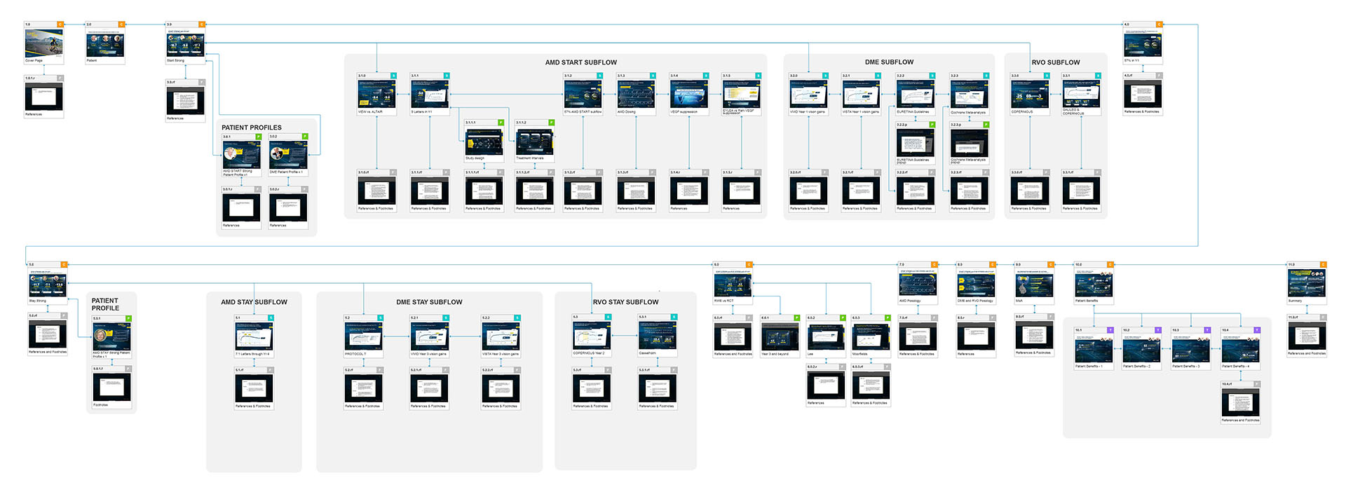
Our main challenge was updating the existing product while keepıng consistency between additional content, updating user flow with further navigation changes, improvement in usability and user interface design. Product was containing nearly 140 screens with multiple user-flows and content domains like sample patient profile/personas, AMD, DME and RVO sub-flows.

My Role
As a UX designer, I was responsible for updating existing information architecture with additional content, Creating sitemap and user flows and follow the consistency in interactions and navigation. I prepared detailed functional specification documents for the development.
The Approach
Our team included from account managers, medical copywriters, digital designers, SMEs and project manager. We researched to understand Bayer’s reps existing struggles and pain points on presentation to HCPs. The total number of screens is too much for a limited display, and we focused on the best possible navigational solution that answers possible conversational scenarios between reps and HCPs.

Problems and Solutions
We successfully delivered or eDetail aid solution to the client. Also, we have requested additional work packages like the web site of the same product and franchise version of it for the other markets.
