Project Definition
Project Name: Design System Development
Role: Lead UX/UI Designer
Tools Used: Figma, Sketch, Storybook
Summary:
Bromcom Computers plc is based in Bromley-London. It provides Cloud MIS (management information software) and Finance software to schools, colleges, local authorities, and multi-academy trusts.
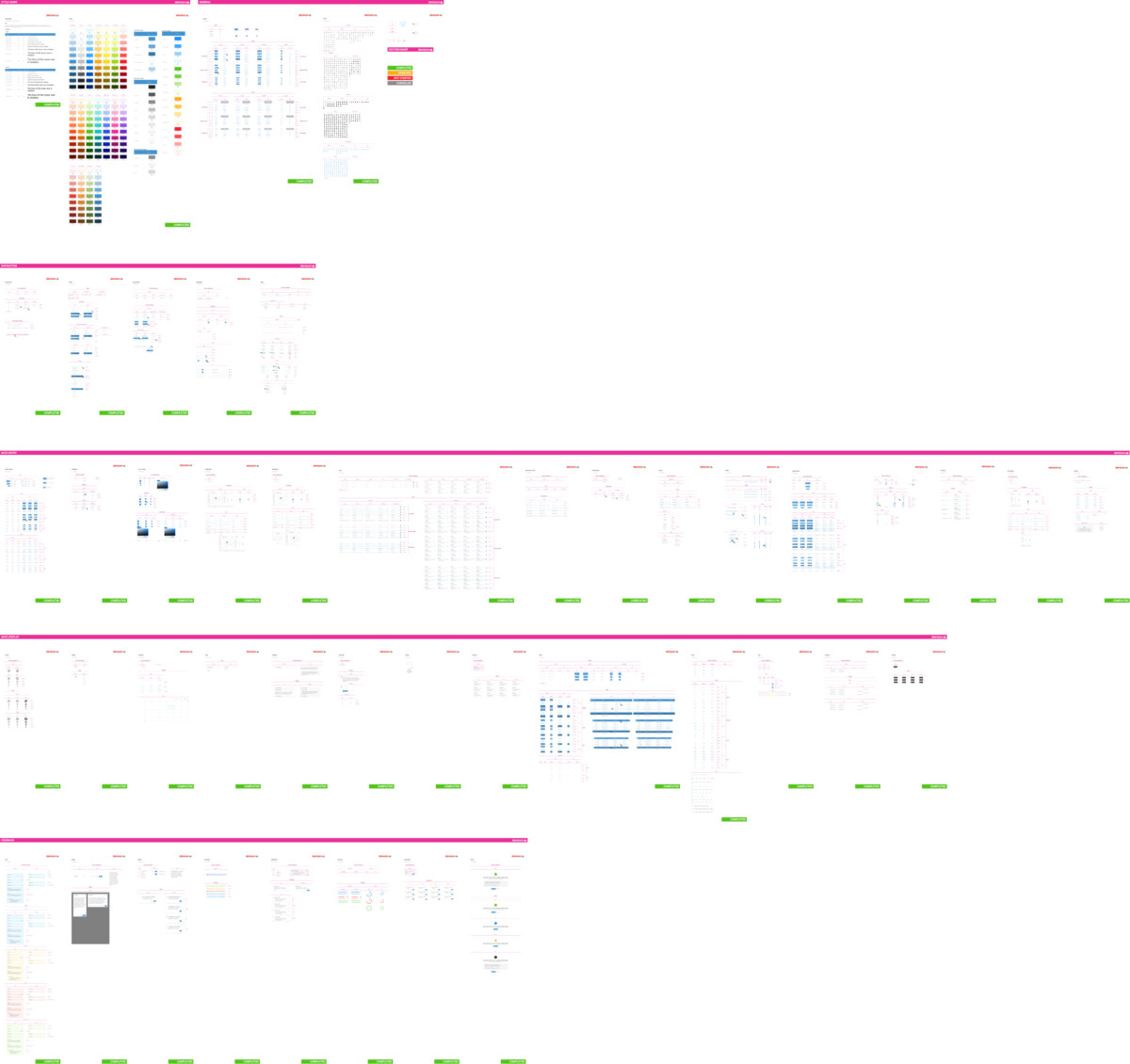
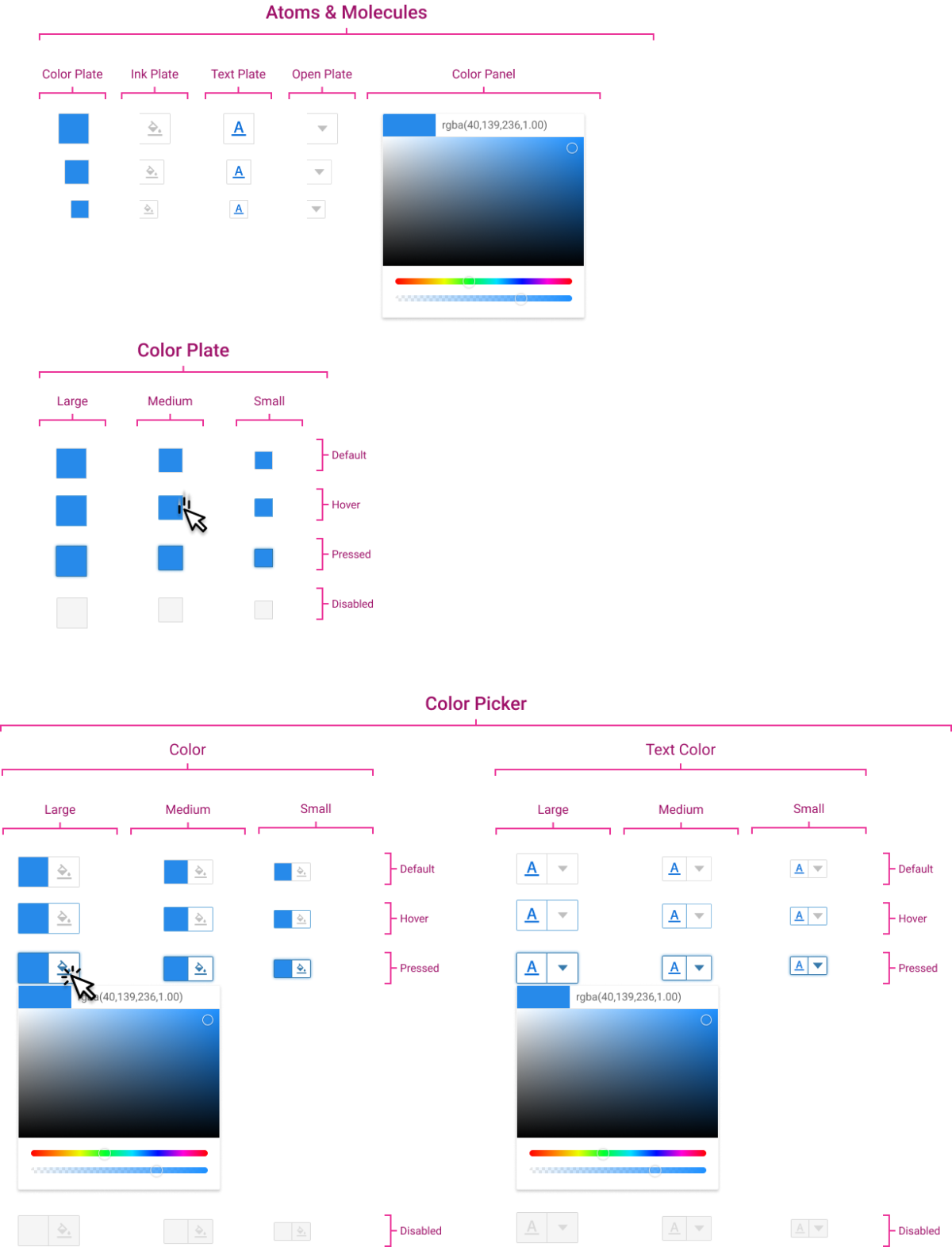
The Bromcom Design System is composed of various widgets, components, and UI elements. It is based on atomic design methodology. Common elements are used across multiple components, ensuring consistency within the design system and making it easier to manage.
Problems and Solutions
The application lacked visual and component consistency across different teams and platforms. This led to inefficiencies, with developers having to recreate UI components from scratch. The challenge was to build a comprehensive design system that ensured consistency and allowed for easy collaboration between designers and developers.

Competitive Analysis, Internal Audits, Stakeholder Interviews uncovered:
- Inconsistencies in the UI components used across different teams.
- Development bottlenecks are caused by frequent re-creation of similar components.
- There is a need for easy documentation and accessibility for all teams involved.
This drove the approach to creating a unified, centralised system to address these issues. Our research identified several key findings: inconsistencies in the UI components used across different teams, development bottlenecks caused by frequent recreation of similar components, and the need for easy documentation and accessibility for all teams involved. These findings drove our approach to creating a unified, centralized system to address these issues. Our methodologies included competitive analysis, internal audits, and internal stakeholder interviews.
The Approach
The design process began with audits of existing screens and components, then defining core design system elements such as buttons, forms, and typography. Moodboards were prepared to represent alternative approaches, competitors’ approaches, and the correlation between the existing product and brand guidelines.
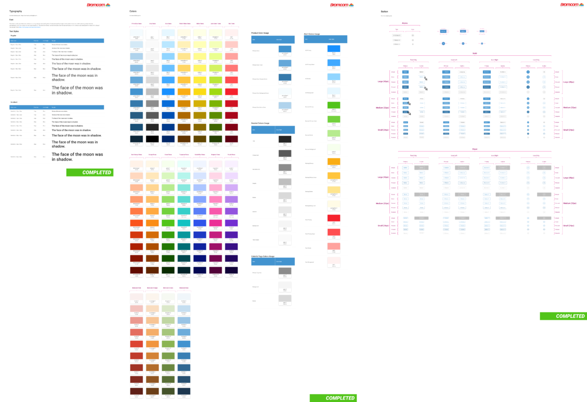
Component Library: A comprehensive library of reusable UI elements was designed, ensuring uniformity across different platforms.
Scalable Typography & Colour Systems: Created guidelines for typography, spacing, and colour schemes to ensure visual hierarchy and consistency.
Documentation: Developed detailed documentation using Storybook by partnering with the development team, making it easy for developers to access and implement components.
The design adhered to a clean, modern aesthetic, focusing on scalability and flexibility. Components were designed to be customisable, allowing teams to tailor them to their specific needs while maintaining consistency.

Impacts
- Increased Efficiency: The design system reduced UI development time, as teams could reuse existing components.
- Improved Consistency: UI consistency across products improved based on audits post-launch.
- Developer Satisfaction: Developer interviews reported the ease of implementing pre-built components.
